Balance in Principles of Design Explained, Step by Step
Balance in the principles of design keeps layouts from feeling lopsided. Compare its main types and use them to steady signs, menus, flyers, and cards.

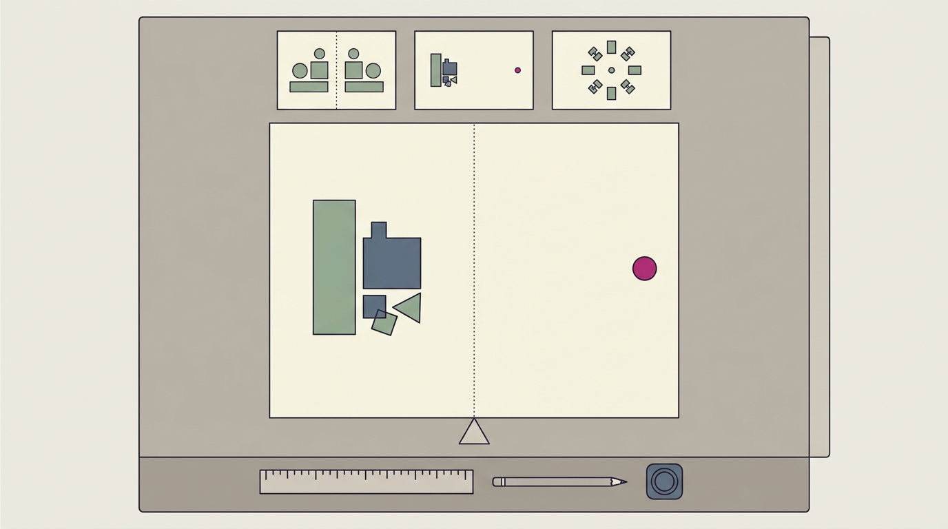
Balance in the principles of design is the way visual weight from text, images, color, and empty space is arranged so a layout feels steady rather than lopsided. It can be symmetrical, asymmetrical, radial, or mosaic-style, and works by counterweighting prominent elements while preserving clear hierarchy and breathing room. In practice, balanced signs, menus, and screens are easier to scan and help guide attention, but balance alone does not ensure readability or accessibility.
Think about a seesaw at the park. If everyone piles onto one end, it tips over fast. Spread the weight evenly, or balance it on purpose, and it sways nicely without crashing.
That’s the idea behind balance in design: how the visual weight of text, images, and color is spread across a layout so it feels steady rather than lopsided.
In this post, we’ll cover the main kinds of balance, how to create it, and where it fits among the other principles of design. Then we’ll put it to work on the signs, menus, flyers, and cards your business already uses.
Why Balance in Principles of Design Matters
Balance is one of the main principles of design, alongside contrast, emphasis, and unity. They matter because they decide how quickly someone understands your sign, menu, or flyer.
How weight gets spread across a layout
Every element carries visual weight, the pull it exerts on the eye. Balance distributes those elements so no corner feels empty or crowded. When the parts reach equilibrium, they form one stable, harmonious whole. The goal isn’t identical sizes.
It’s a page that feels settled rather than lopsided.
Picture a bakery board crowding every special into one corner. Moving one banner to the far side and giving the prices room helps customers spot them faster.
How balance helps people read a page
Balance guides the eye in sequence, supporting readability and hierarchy, the ranking of what matters most. It also lowers cognitive load, the mental effort needed to make sense of a page.
Earlier work by Christensen et al. (2020), noted in a study of mobile news interfaces, ties cluttered, unbalanced screens to more effort during searches. Balance also builds credibility and trust.
A study of online credibility judgments found that a poorly designed page can leave a negative impression even when its content is solid. Balance pairs with emphasis, which decides what gets noticed first.
How balance changes what viewers feel
Here’s what each one tends to feel like:
- Symmetry brings order, calm, and stability.
- Asymmetry brings tension, energy, and movement.
- Imbalance can make a layout feel uneasy.
A study of salient visual elements in web page design found that centered, symmetrical, balanced layouts were experienced as pleasant and calming.
Track bounce rate (visitors who leave without acting) and conversions (calls, bookings, or form fills) before and after a change to see if the calmer page works.
The Main Kinds of Balance
The three types of balance in interior design are symmetrical balance, asymmetrical balance, and radial balance, and they work just as well on a sign or a menu.
Symmetrical layouts feel formal and stable
In symmetrical balance, elements mirror each other across a center line. Picture a dentist’s flyer with a centered logo and matching columns of services. It feels formal, calm, and trustworthy.
Approximate symmetry, where both sides are close but not identical, softens the look. The risk is a static look, though: when everything matches, the eye has nowhere to go. Safe, but stiff.
Unequal elements that still carry equal weight
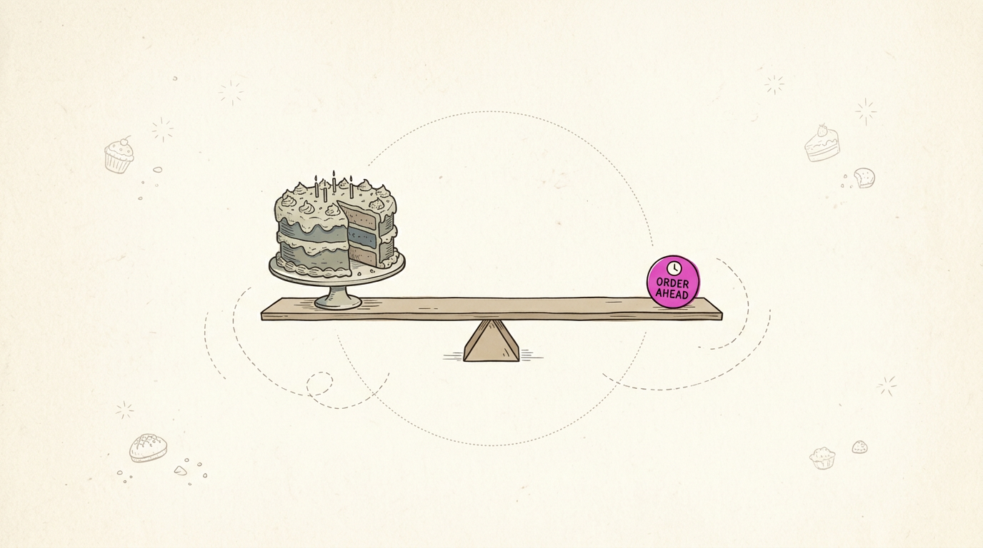
Asymmetrical balance uses unequal elements that still feel even. A bold photo on one side can be offset by smaller items or a splash of color on the other. It feels informal, dynamic, and active. It’s harder to get right than symmetry.
Counterweights do the balancing, and distance matters too: a small item far from the middle can offset a larger one close in, like kids on a seesaw. The goal is to feel even, not to measure it.
On a bakery’s takeout menu, a big cake photo on the left and a small order-ahead badge on the right send the eye straight to the order line.
Arranging elements around a central point
Radial balance arranges elements around a central point, like spokes around a hub. The center becomes a strong focal point, and the eye circles out and back again. Think of a wheel, a mandala, or a round logo.
A plumber’s business card with a circular emblem in the middle puts the name where people look first. Put whatever you most want noticed at the center, whether that’s your shop name or your phone number.
Mosaic-style patterns with no focal point
A mosaic-style pattern spreads elements evenly across the whole space, with no single spot pulling the eye. Tiles, repeated icons, and grid layouts all work this way.
The even spread suits responsive design, where a page rearranges itself to fit whatever screen it’s on, from a phone to a desktop.
On a salon’s phone-sized service page, four equal tiles stack neatly, each with a price and a booking button, so clients can scan every option. Crowd every corner, though, and it feels busy.
Combining balance in every direction
Real layouts often mix types, and balance can run four ways:
- Horizontal. Side to side, like a row of menu columns.
- Vertical. Top to bottom, like a header above a price list.
- Radial. Around a center, like a round logo.
- Diagonal. Corner to corner, which adds energy to a flyer.
Mixing works best when one type leads. Take a restaurant’s table tent: a centered name on top, a photo and specials side by side, and a round patio stamp in one corner.
Consistent spacing between those blocks makes it read as one card, so no special gets lost. The goal is unity rather than sameness.
Ways to Create Balance in a Layout
Balance doesn’t come from making both sides identical. It comes from deciding how much pull each element carries.
Use color to balance heavier areas
Color is the fastest way to shift weight. Visual weight is how heavy something looks, and dark, saturated colors feel heavier than pale ones.
Say a bakery flyer has a dark brown header. A small mustard-yellow accent in the opposite corner steadies it, as long as the accent stays small.
Contrast helps too. Complementary colors, which sit opposite each other on the color wheel, create strong contrast that draws the eye.
Balance big shapes with smaller counterweights
Large shapes need smaller counterweights: a few small elements that together match the big one’s pull.
Different shapes carry different weight. A solid circle feels heavier than a thin outline, so a small filled icon can balance a larger outlined box.
A hero image, the big photo that dominates a piece, outweighs a text block of the same size. Give the text a bold headline to even things out.
A salon owner’s holiday flyer might pair a large photo on top with a bold offer and phone number in the bottom corner, so the number is easy to spot.
How type sizes and fonts share weight
A large headline draws the eye first, so pair it with lighter body text.
Font pairing means choosing two fonts that work together: one bold for headlines, one clean and plain for body copy.
Generous line spacing feels airy and easy to scan, while cramped lines feel heavy. Use one alignment per block, since mixing them can look unsteady.
Think of a diner’s menu with bold section headers and small, plain item descriptions. Guests scan the headers, then read prices without squinting.
Use negative space to avoid crowding
Negative space is the empty area around your content, and it isn’t wasted room. Crowding is a common mistake on small-business signs and flyers.
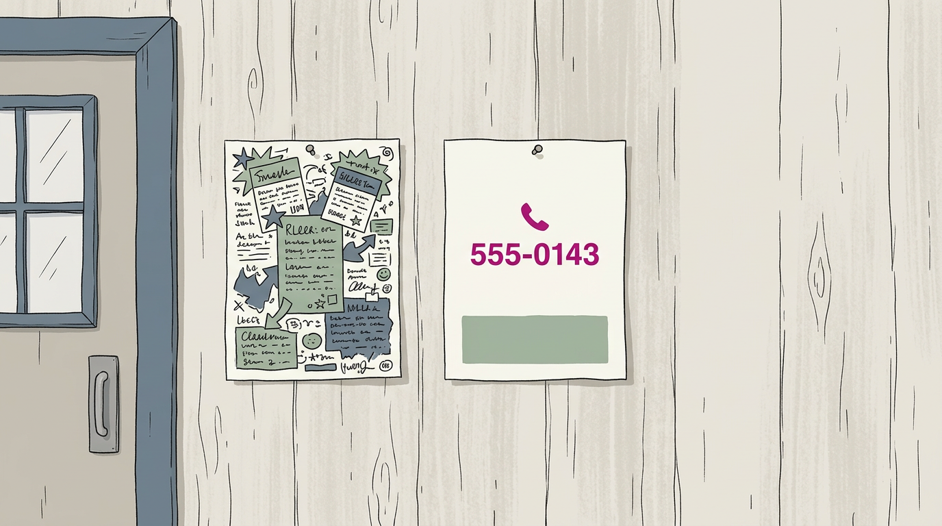
Open space frames focal points, so a lone phone number gets noticed first. It also offsets strong color: a bold red block sits calmly beside a generous margin of white.
How far elements sit from the center
The central axis is the imaginary line down the middle of a page. The farther an element sits from it, the more it pulls the layout toward its side.
Keep elements away from the borders. Items jammed against the edge look cramped and can get trimmed off in printing.
Texture, line, and proportion can also act as counterweights:
- Texture adds interest to a bare side.
- Line, like a thin rule, balances a heavy block without adding bulk.
- Proportion, or size relative to neighbors, sets how much weight an element carries.
A landscaper’s flyer with a bold logo in the top-left corner can be balanced by a thin rule and a small before-and-after photo, set in from the bottom-right edge, so the flyer feels settled rather than top-heavy.
Weight decides balance. Symmetry is optional.
How Structural and Visual Balance Differ
Balance comes in two forms, and they’re easy to mix up. One is about real weight, and the other is about how a design feels to the eye.
Structural balance in buildings and masts
Structural balance is physical equilibrium. An object stays upright when its weight is spread evenly around a support point. The simplest picture is a seesaw or a kitchen scale: equal weight on each side keeps the arm level.
Height adds a second rule. A tall, narrow object needs a heavy or wide base to stay upright, which is why flagpoles and masts are anchored deep. Buildings follow the same logic. A sign pole can stand tall only because its base is heavy enough to hold it.
What does visual balance mean?
Visual balance is the perceived, or illusory, equilibrium of a design. Nothing is actually going to tip. It’s about how a design looks, not how much it weighs, and that’s an aesthetic judgment made by the viewer.
Two people can look at the same flyer and disagree about whether it’s balanced.
Designers create this feeling with imaginary counterweights. A bold price or logo can offset a large block of text on the other side, much like a lighter child far out on a seesaw balances a heavier one near the middle.
The idea comes from everyday physics intuition, so you already know how it works. Consider a bakery owner designing a menu board: if the logo, prices, and bread photo all crowd the top left, the board looks like it’s sliding off.
Move the logo to the lower right, and customers’ eyes land on the specials instead.
In short, visual balance means arranging elements so nothing looks like it’s about to slide off one side. You’ll know it when it works.
How to Apply Design Principles?
To apply design principles, ask one question of every sign, menu, and screen: does anything tip the eye to one side? Balance answers it, and it’s everywhere you work.
Balance on websites and app screens
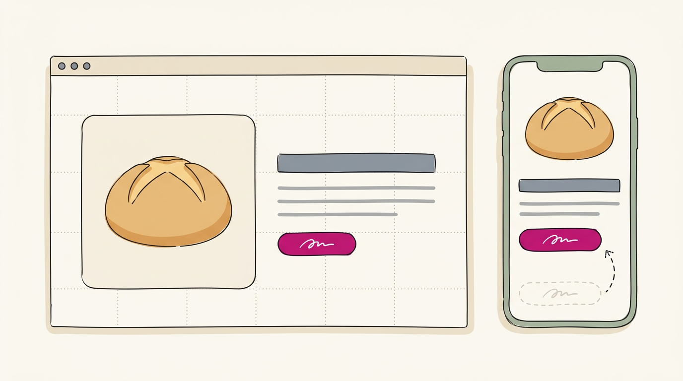
Picture a bakery owner whose homepage pairs a large bread photo with a headline, short text, and an order button. Those elements carry similar visual weight, so visitors don’t have to hunt.
Study the Salesforce homepage to see a dominant image counterweighted by text and a call to action. Grid-based layouts keep elements evenly spaced in columns and rows.
On a phone the layout stacks, so you’ll want to move the button back up near the headline.
How well-known logos use balance
Many famous logos use symmetrical balance, where both halves mirror each other:
- McDonald’s golden arches
- Target’s bullseye
- the Rolex crown
- the Bentley winged B
Chanel’s interlocking Cs are symmetrical, while Apple’s bitten apple is asymmetrical and still feels balanced. Law firms and financial institutions often lean on symmetry to signal stability.
You can borrow that on signs and van graphics: center the name, then match the phone number and services on either side.
Keeping posters and print pieces balanced
A movie poster’s title anchors the center while credits sit around it. Poster design galleries repeat that pattern: one strong focal point, with supporting text across from it.
On brochures and business cards, put the logo on one side and contact details on the other, with matching margins. Picture a diner owner whose menu crowds prices into one corner.
Aligning prices in one column and spacing sections evenly means customers don’t flip back and forth.
Choosing mat widths and proportions
Mat widths and proportions shape how a framed print feels. Wider mats give a piece room, and margins should look even on all sides. An accent line too near the frame edge looks cramped, so move it inward until its spacing matches the other edges.
Work through each piece step by step, in this order:
- Sketch first. Block out text, image, and logo positions before picking fonts.
- Place the heaviest element. Set the logo, headline, or photo near the center or a grid point.
- Counterweight it. Add smaller pieces opposite until the page feels even.
- Check at a distance. View a printed proof or your phone, then adjust anything that tips.
Where Balanced Layouts Usually Go Wrong
Balance sounds simple until you’re fitting a headline, a phone number, and a photo onto one flyer. Two quick tests catch most problems before anything goes to print.
Squint at the page to see if it looks even, then check whether the eye lands on the headline first.
Errors that throw off balance
- Overcrowding. Too many elements compete for attention, so nothing feels anchored. Cut a line or two and see if the page breathes.
- Excessive symmetry feels static. Balance means feeling even, not being identical. Mirrored menu columns can read like a form, not a feast.
- Ignoring visual weight. A bold photo pulls harder than a line of text. A huge logo beside a tiny phone number tips the whole van sign over.
- Low contrast. A bakery owner’s cream prices on a white menu card look elegant up close, but customers squinting from the line can’t read them.
- Disrupted user flow. If the eye bounces around instead of moving from headline to offer to phone number, the layout works against you.
Cautions and terms often confused
- Balance versus alignment. Alignment is about where elements line up, while balance is about how heavy each side feels. Perfectly aligned text can still look lopsided.
- Balance doesn’t guarantee accessibility. A layout can feel balanced and still be hard to read, so check readability on its own.
- Contrast ratio requirements. A contrast ratio compares the brightness of text against its background. The Web Content Accessibility Guidelines (WCAG) 2.2 set a minimum of 4.5:1 for text and 3:1 for large text.
- Use ‘effective’, not ‘eye catching’. Call a design effective when it gets a customer to call or visit. Eye catching only means it stopped a glance.
Balance isn’t about making everything match. It’s about giving each element a job and placing it so the eye settles where you want it to.
Whether you share the weight evenly or pair a small, bold element against a larger, quieter one, the goal stays the same: a layout that reads easily at a glance.
Start with one piece this week. Pull up the sign, menu, or flyer that gets the least attention and check whether its weight sits where you want it. A few small adjustments can make a big difference in how customers see your business.
A steady layout gets read. A lopsided one gets skipped.
References
- Research on the Influence of Interface Visual Design Features of Mobile News on Cognitive Load: A Study of Elderly Users in China — pmc.ncbi.nlm.nih.gov (2025)
- Appraisals of Salient Visual Elements in Web Page Design — onlinelibrary.wiley.com
- Visceral and cognitive levels of credibility judgment in an authorless environment: A factor analysis of the influence of visual design — asistdl.onlinelibrary.wiley.com (2007)
- Web Content Accessibility Guidelines (WCAG) 2.2 — w3c.github.io (2026)
Questions
Which principle of art shows balance?
Balance is the principle of art that shows how visual weight is distributed across a composition. It can feel symmetrical, asymmetrical, or radial.
What are the 5 basic principles of design?
Five commonly taught principles of design are balance, contrast, emphasis, movement, and unity. Some design frameworks use different lists or include additional principles such as rhythm and proportion.
What are the three types of balance in interior design?
The three types of balance in interior design are symmetrical, asymmetrical, and radial balance. Symmetry mirrors elements, asymmetry uses unequal elements that feel evenly weighted, and radial balance arranges elements around a central point.
What are design principles in a project?
Design principles are guidelines for organizing a project's elements so the result is clear, coherent, and effective. They include concepts such as balance, contrast, emphasis, and unity.
How to apply design principles?
Start by identifying the project's main message and most important element. Arrange the other elements around it, balancing their visual weight with size, color, spacing, and position, then review the result for clarity and readability.
Why are the principles of design important?
Design principles help people understand information quickly and make a project feel organized and coherent. They can guide attention, improve readability, and shape the impression the design creates.
What is an example of balance?
A flyer with a large photo on the left and a smaller, bold offer on the right can feel balanced if the offer counterweights the photo. The elements do not have to be identical in size.
What does visual balance mean?
Visual balance is the perceived equilibrium of elements in a design. It means the layout looks settled rather than as if its visual weight is pulling toward one side.
Sources
- Research on the Influence of Interface Visual Design Features of Mobile News on Cognitive Load: A Study of Elderly Users in China - PMC, pmc.ncbi.nlm.nih.gov,
- Visceral and cognitive levels of credibility judgment in an authorless environment: A factor analysis of the influence of visual design, asistdl.onlinelibrary.wiley.com,
- Appraisals of Salient Visual Elements in Web Page Design, onlinelibrary.wiley.com
- Web Content Accessibility Guidelines (WCAG) 2.2, w3c.github.io,