Packaging design 101: the core elements and process
Packaging design shapes first impressions and helps products stand out. Follow the design process from choosing structure to preparing print-ready files.

Packaging design is the planning of a product’s box, bag, label, or other container, including how it looks, what it is made from, and what information it provides. Effective packaging protects the product, communicates its benefits and brand identity clearly, and is easy to open, use, ship, and understand. Matching it to the customer and keeping its colors, logo, and type consistent with other brand materials helps products stand out without requiring a large budget or print run.
Think about the last coffee bag or takeout box that made you smile before you’d tasted a thing. That’s packaging design at work: planning the look, structure, and information of the container that carries a product to the customer.
This guide covers the full picture: core elements, the design process, print prep, and the 5 P’s.
We’ll also get practical for local businesses, from small runs and stock versus custom choices to keeping your packaging matched to your signs, menus, and print.
Packaging Design Basics and Why It Matters
Packaging design is deciding how a product looks, what it’s made from, and what its box or label tells buyers. The 5 P’s of packaging are a five-part framework covered later in this article.
The job packaging does for products
It’s less about covering the product and more about selling it. Packaging does three jobs:
- Look, materials, and function. Colors and materials set the first impression, and the package must work.
- Protect product and inform. It keeps the product safe in transit and tells buyers what’s inside.
- Communicate brand identity. It signals who you are, so match its colors to your sign and menu.
How packaging shapes buyers and brand image
Packaging helps drive purchase decisions. A study on visual packaging for food found that attitudes toward packaging directly influence perceived quality and brand preference.
Packaging can help buyers recognize you and build brand recall, meaning they remember you later. A study of packaging redesign in Vietnam examines how recognition and recall connect shoppers’ views of a redesign to plans to buy again.
For many buyers, the package is their first physical brand encounter. Design can also change whether a product feels premium.
A study of typical foods from Portugal’s central region found a very significant relationship between design quality and the quality shoppers attributed to the product.
What packaging designers decide and communicate
Designers decide the look and materials, from colors to the box. The front panel has limited room, so they pick the one or two key benefits and make them readable at a glance. Every inch counts.
Think of a bakery choosing between plain paper and a clear window box. The window says see what’s inside, and a good designer helps you pick the one that fits your message.
What Makes Packaging Work Well
Good packaging protects what’s inside, tells shoppers what they’re getting, and looks like your business made it.
Colors, type, and logos that stay consistent
Color theory covers how colors work together and what they signal, and typography covers how your letters are chosen and spaced. Aim for recognizable over clever.
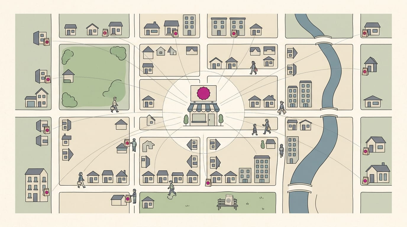
Keep your logo and imagery consistent across the box, the sign, and the menu, because that’s brand alignment. Picture a bakery owner whose cookie boxes match her awning’s cream and brown. A passerby spots one and knows it’s hers before reading a word.
Match signs, menus, and van branding to one palette and logo.
Picking materials that protect and open easily
Customers should open a package without a box cutter and stack it neatly on a shelf.
Paperboard is thin, sturdy board for shelf cartons. Corrugated is the ridged board inside shipping boxes. Choose for the trip, not just the look. Bumpy roads don’t care how pretty the box is.
A candle maker who ships jars uses a corrugated mailer with a cardboard insert, so fewer arrive cracked. That insert is your cushioning, the padding that absorbs bumps.
Ordering information so shoppers read it right
Put the product name first, with one or two benefits right under it, since shoppers scan a panel in a predictable order.
Barcodes and required warnings must stay scannable, and labeling rules depend on what you sell and where. Check those rules before you print.
With limited space, cut copy that doesn’t help someone decide. A salon owner with a crowded hair product label moves the name to the top and trims the story to one line, so shoppers grasp it at a glance.
Matching the feel to who is shopping
A vintage script and kraft paper feel homemade, while matte black and gold read as upscale. Pick the feel that fits your prices.
Accessibility means designing for people with low vision, older shoppers, and second-language readers. Use high-contrast colors and readable font sizes.
Gift buyers want it to look special, while everyday buyers want it quick to open. Consider a coffee roaster who sells a windowed gift box and a plain refill bag. The gift box makes the sale, and the bag keeps regulars coming back.
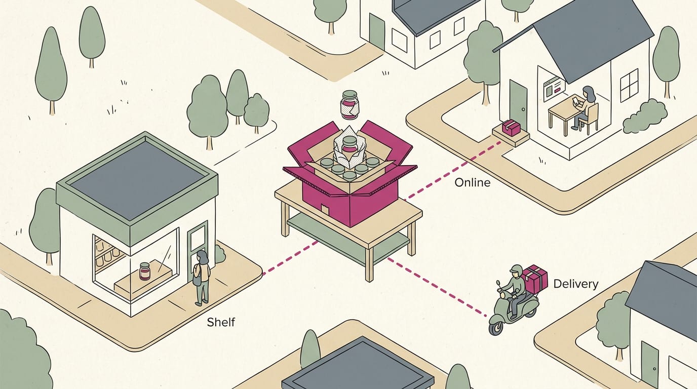
Designing each layer for retail, online, delivery
Think of packaging in three layers:
- primary packaging touches the product,
- secondary packaging groups units, and
- tertiary packaging is the bulk shipping box.
On a shelf, the front panel has seconds to sell. Online, the inside counts as much as the outside.
Click-and-collect, where customers order ahead and pick up in store, needs a clear order number on the bag. Takeaway boxes must hold heat, and delivery packaging must survive the drive.
A restaurant manager might use one sturdy box for dine-in and delivery alike, so there’s only one to stock.
How a Packaging Design Comes Together
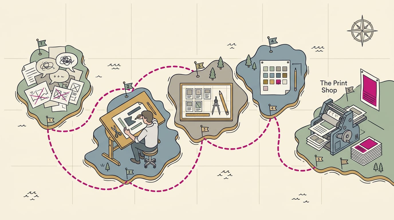
Good packaging grows step by step, from a clear plan to real tests.
Start with research and a clear brief
Write down what the package must do, who buys it, and how competitors already look.
- Product, audience, and competitors. Describe what’s inside, who it’s for, and who you’re up against.
- Packaging brief. Write a one-page summary of your budget and the date you’ll need boxes by.
- Brand assets and copy. Gather logo files, colors, fonts, and required wording.
Then decide whether to design it yourself or hire a designer: a designer costs more money up front, while doing it yourself costs more of your evenings.
Sketching a few concepts and picking styles
Sketch two or three rough concepts before you commit. Think of a bakery owner who sketches three versions: a hand-drawn logo, a close-up of her cookies, and just her brand colors and bold font.
She keeps the one her counter staff point to, since they hand out those boxes daily.
Then choose materials and gather style references. Materials shape how a package feels, not just how it looks.
Turning sketches into digital artwork
- Vector-based design tools. Use a program that saves vector files, built from math-defined shapes that stay sharp at any size.
- Versions and quick adjustments. Save each change as a new version (say, box-v2) so you can always go back. Small tweaks should take minutes.
- Online editors and templates. Start from a template close to your box shape, then swap in your own art.
Testing mockups, shipping, and getting feedback
Build a mockup, a realistic preview of the finished package. A restaurant manager folds a test takeout box and finds the QR (quick response) code for online ordering sits on the fold, where it won’t scan. Checking is cheap; reprinting isn’t.
- Paper mockups and prototypes. Print the layout, cut it out, fold it, and handle it like a customer would.
- Test closure and shipping. Check that the lid or seal opens and holds, and give a packed box a few shakes.
- Scan QR codes and barcodes. Confirm every code opens the right page or reads the correct number.
- Peer and customer feedback. Show it to colleagues and a regular customer, and ask what they notice first.
- Ask your local printer for proofs. A proof is a test print of your final file. Request one before the full run.
Keeping packaging costs under control
- One-time vs. per-item costs. Design and setup are paid once; each box or label is paid for per unit.
- Compare quotes and minimum order quantity (MOQ). The MOQ is the smallest run a supplier will produce, so a low unit price can mean buying more than you need.
- Budget-friendly sustainable options. Simpler, recycled-content materials with one-color printing usually keep per-item costs down.
- Short runs: stock boxes plus stickers. Stock boxes suit small batches, while custom boxes make sense once you reorder steadily. A branded sticker makes a stock box look like yours.
Design Tips That Make Packaging Stand Out
Standing out comes down to a few deliberate choices.
Leading the eye with color and size
Color, type, and size decide where customers look first. Make your focal point, usually your logo or product name, the largest element on the pack.
Each visible side of a box or bag is a panel, and each panel needs one main job. A bakery owner puts her logo large on the lid and one bold word, like “Cinnamon,” below it. Everything else should support that message, not compete with it.
Why empty space helps packaging look clean
Empty space, or white space, is the blank area around your text and images. Leave generous room; don’t fill every corner. It gives the eye somewhere to rest and keeps a pack from looking crowded.
Keep your palette to two or three colors. A coffee roaster who uses cream, forest green, and one accent color on every bag gets a look customers recognize, and matching menu colors tie it together.
Telling your brand story on the pack
Your pack travels farther than any sign, so tell customers who you are, not just what you sell. A family recipe or one short line about your work gives them a reason to remember you.
Aim for a design someone could describe to a friend, such as a signature shape. Then decide between playful and minimalist. Playful suits a kids’ party shop, while plain type suits a dental office’s take-home kit. Stick with your choice.
Knowing when to redesign comes down to one check: does the pack still match your signs and menus? If a salon’s bags show an old logo beside a newly painted waiting room, it’s time to refresh.
Getting Files Ready for the Printer
A file can look perfect on screen and still print wrong. A few settings before you send it can save you a reprint.
Using dielines for cuts and folds
A dieline is the template showing where your piece gets cut, folded, and torn. Ask your supplier for the approved version, not one you draw yourself.
- Cut lines mark the outer edge.
- Fold lines show where the material bends.
- Perforation guides show where it tears.
Keep the dieline on its own layer so you can hide it before export, and keep the template at its original scale. Resizing it, even slightly, moves every cut off its mark.
Consider a bakery owner designing a holiday cake box. She sets her artwork over the supplier’s template at original scale, so the folds land where the box bends and the lid closes cleanly.
Setting up print-ready files correctly
Bleed is extra color past the cut edge, so a small shift doesn’t leave a white sliver. Keep text and logos inside the safe area, clear of the cut.
Screens mix light with RGB (red, green, blue), but printers mix ink with CMYK (cyan, magenta, yellow, and black). Bright screen colors can shift in print, so design for print colors from the start.
Resolution counts too: aim for 300 pixels per inch (ppi) at printed size. A photo that looks sharp on your phone can blur on a box.
Outlining converts letters into shapes, while embedding packs the font into the file. Either way, your typeface survives the trip to the printer.
Vector logos are built from lines and shapes, so they scale up crisply. Ask your designer for one, since a copy pulled from your website can turn jagged on a box.
Catch it in the file. Don’t find it on the box.
Tools Designers Use for Packaging
Every box starts on a screen, and each task calls for a different tool. Here’s what designers use, and how you can get a head start yourself.
Which Adobe app handles each task
Each app has a clear role:
- Illustrator handles vector art (shapes built from lines and curves that stay sharp at any size) and the dieline, the cut-and-fold outline the printer follows.
- Photoshop handles photos and mockups, like product images and flat previews.
- InDesign handles text layouts, so ingredient lists and care instructions stay neat.
- 3D mockups with Dimension or Stager wrap your design around a three-dimensional box before you commit to a print run.
Illustrator owns the outline of the box, while Photoshop owns the picture on it.
Designing it yourself with templates and editors
You don’t need a designer to get started. Two shortcuts make it lighter:
- Adobe packaging templates come with the panels and fold lines already placed, so you only swap in your artwork.
- Supplier template generators let you enter your box’s dimensions and download a matching dieline.
Designing without a designer works well for a simple box, especially if you reuse the fonts and colors from your sign and menu. Keep it simple.
Picture a bakery owner who needs a box for cinnamon rolls. She downloads a supplier template, places the logo from her storefront sign, and matches her menu colors.
Customers who carry that box home see the shop’s name again, which keeps the bakery top of mind.
Sustainable Packaging and Digital Links
Your packaging is the last thing a customer holds, so make it easy on the planet and easy to use.
Picking eco materials and backing up claims
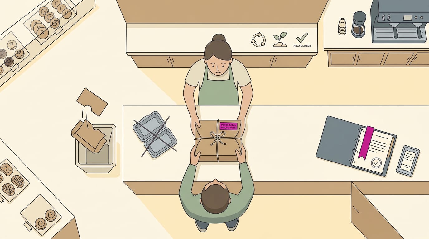
Start with the material. Look for recycled (made from material already used once), recyclable (your local service can process it), or compostable (it breaks down in a composting system). Pick only the word that’s true.
Cut what you don’t need. Think of a bakery owner who swaps a plastic clamshell for a paper box and drops the extra sleeve. Aim for less packaging, not more.
Tell customers what to do with the pack. A short line like “Recycle the box, compost the lid” beats a vague green leaf.
Only print a green claim you can prove. If you say “eco-friendly,” keep the supplier paperwork that backs it up.
Adding QR codes and NFC to packs
Point a Quick Response (QR) code at something useful. Good destinations include:
- Your online menu
- A product care guide
- Your booking page
Think of a salon owner who prints one on a product box, so a happy customer can book the next visit right at the counter.
A dynamic QR code stays the same printed pattern, but the link behind it can change. Update your hours without reprinting a single box.
Near-field communication (NFC) chips open a link when a phone taps them. Not every phone reads them, so pair one with a QR code.
Put the code on a flat spot, away from seams and curves, with a clean margin around it. Dark on light scans best, so keep busy patterns away from it. Always scan a test copy.
Current Trends and the Unboxing Moment
Packaging is often the first thing a customer touches after buying. The unboxing moment is that first look and feel as the package opens.
Popular looks shaping packaging right now
Most of these share one goal: making a box look considered rather than crowded. Four looks stand out:
- Bright colors and illustrated ingredients. A bakery might print a hand-drawn lemon on its cookie box, so customers see what’s inside first.
- Tactile textures and a luxury feel. A soft-touch finish makes a plain box feel premium, and you don’t need to cover every surface.
- Patterns and handwritten type. A repeating pattern or a note-style script feels personal, like it was written for the customer.
- Minimalist logos and line drawings. A clean logo and a few simple lines look sharp and match your signs and menus.
Personal touches that make unboxing memorable
Small extras turn a purchase into a memory. Four are worth adding:
- Branded tissue and notes. Tissue printed with your logo puts your name in front of the customer first.
- Thank-you cards and inserts. A handwritten card or care tip gives people a reason to keep the box and remember you.
- Seasonal refreshes with tape or stickers. A holiday sticker or new tape color every few months gives regulars something new to notice.
- Labels and tape for a premium feel. A custom seal or branded tape can make a standard box feel like a gift.
Think of a florist who tucks a short care card with the shop’s number into every bouquet box. If a customer sticks it on the fridge, that number stays where they’ll see it the next time they need flowers. Simple, and hard to forget.
Careers, Certificates, and Common Questions
Certifications can prove the skills behind your design work.
Adobe credentials that help your career
An industry-recognized credential is one that employers in your field recognize. Adobe offers certifications in Photoshop, Illustrator, and InDesign.
A Coventry University conference paper on professional accreditation describes embedding an accreditation scheme built on the Adobe Certified Associate (ACA).
Consider a restaurant manager who earns an Illustrator credential and designs her own takeout box labels. They match her sign and menu, and she stops waiting on a designer for every reprint.
A credential shows you can do the work, not just talk about it. Proof counts.
Badges help career opportunities by making your skills easy to spot on a résumé or online profile.
Common questions about packaging design
Packaging design is planning the look and structure of the box, bag, label, or jar a product comes in. It protects the product and tells people what’s inside.
Your packaging is often the first part of your brand a customer touches, so keep its colors, logo, and fonts consistent with your sign and menu.
Three Adobe programs cover the core tasks:
- Illustrator: logos and dielines (the flat cutting template for a box)
- Photoshop: photo editing
- InDesign: text-heavy layouts
Confirm your printer’s minimum size for small print before you commit. Test each barcode at its final printed size, since one that scans on screen won’t always scan on the box.
Use only photos and fonts you own or have licensed, and keep those records with your files. Store layered source files in one labeled folder, and reprints become a quick job.
Good packaging protects what’s inside, sets the right expectation, and sounds like the same business your customers meet at the counter. You don’t need a big budget or a huge print run to get there.
Start small: pick one box, bag, or sleeve, line it up with your sign and menu, and build from there. Each piece you get right makes the next one easier.
Your packaging works every shift you do, so make sure it speaks for your business.
References
- How packaging redesign shapes repurchase intention through brand memory: evidence from FMCG markets in Vietnam — doi.org (2026)
- Influence of packaging design on product quality perception. A study about typical foods from the central region of Portugal — revistas.ucm.es (2026)
- The influence of visual packaging design on perceived food product quality, value, and brand preference — doi.org (2013)
- Testing testing: Embedding professional accreditation to enhance employability within creative disciplines — pureportal.coventry.ac.uk (2016)
Questions
What is a good packaging design?
Good packaging design protects the product, is easy to open and use, and clearly tells customers what they’re getting. It also fits the audience and looks consistent with your brand’s logo, colors, and type.
What are the 7 basic steps to packaging design?
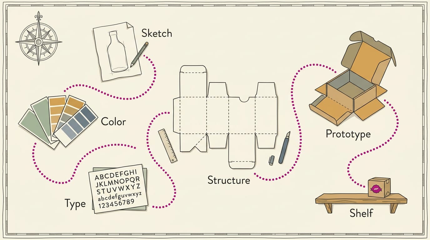
A practical seven-step packaging design process is: research your product, audience, and competitors; write a brief; sketch concepts; choose a concept and materials; create digital artwork; build and test a mockup; and prepare final files for printing. Check the package’s fit, closure, durability, and scannable codes before approving a full run.
How do I design my own packaging?
Start by choosing a product and writing down who will buy it, what the package needs to do, your budget, and when you need it. Gather your logo, brand colors, fonts, and required wording; sketch a few ideas; then use a supplier dieline or template to create the artwork. Make and test a mockup, get feedback and a printer’s proof, and confirm labeling rules before printing.
Sources
- The influence of visual packaging design on perceived food product quality, value, and brand preference, doi.org,
- How packaging redesign shapes repurchase intention through brand memory: evidence from FMCG markets in Vietnam, doi.org,
- Influence of packaging design on product quality perception. A study about typical foods from the central region of Portugal | Arte, Individuo y Sociedad, revistas.ucm.es,
- Testing testing: Embedding professional accreditation to enhance employability within creative disciplines - Conference Paper, pureportal.coventry.ac.uk,