Bad Website Design: Costly Signs and How to Fix Them
Bad website design sends customers elsewhere. Spot costly navigation, mobile, trust, and call-to-action problems, then fix what loses business first.

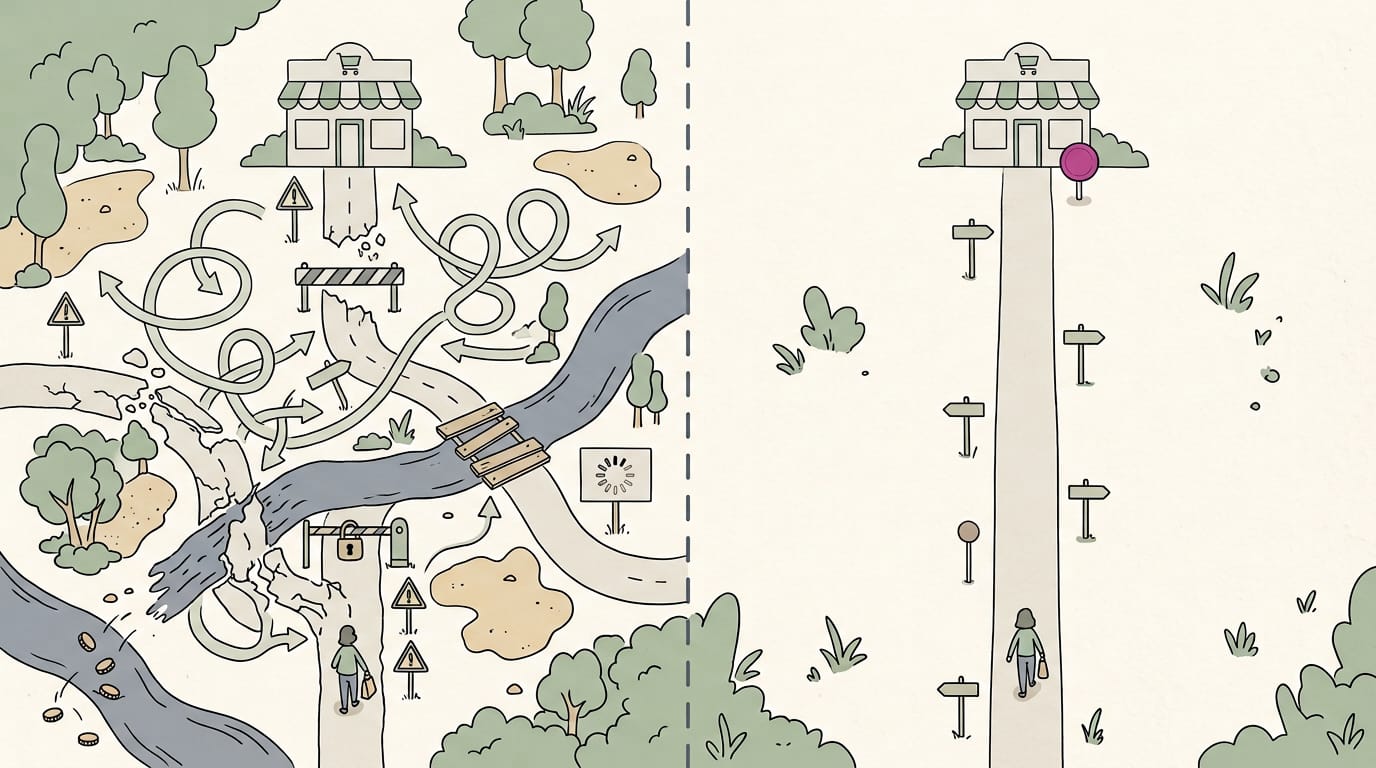
Bad website design is anything that makes it difficult for visitors to find information, trust a business, or take the next step. Clear navigation, readable content, fast mobile-friendly pages, accurate details, and visible calls to action help people move from browsing to calling, booking, or buying. In practice, fixing the snags that block those actions can improve the visitor experience and prevent lost leads without requiring a full rebuild.
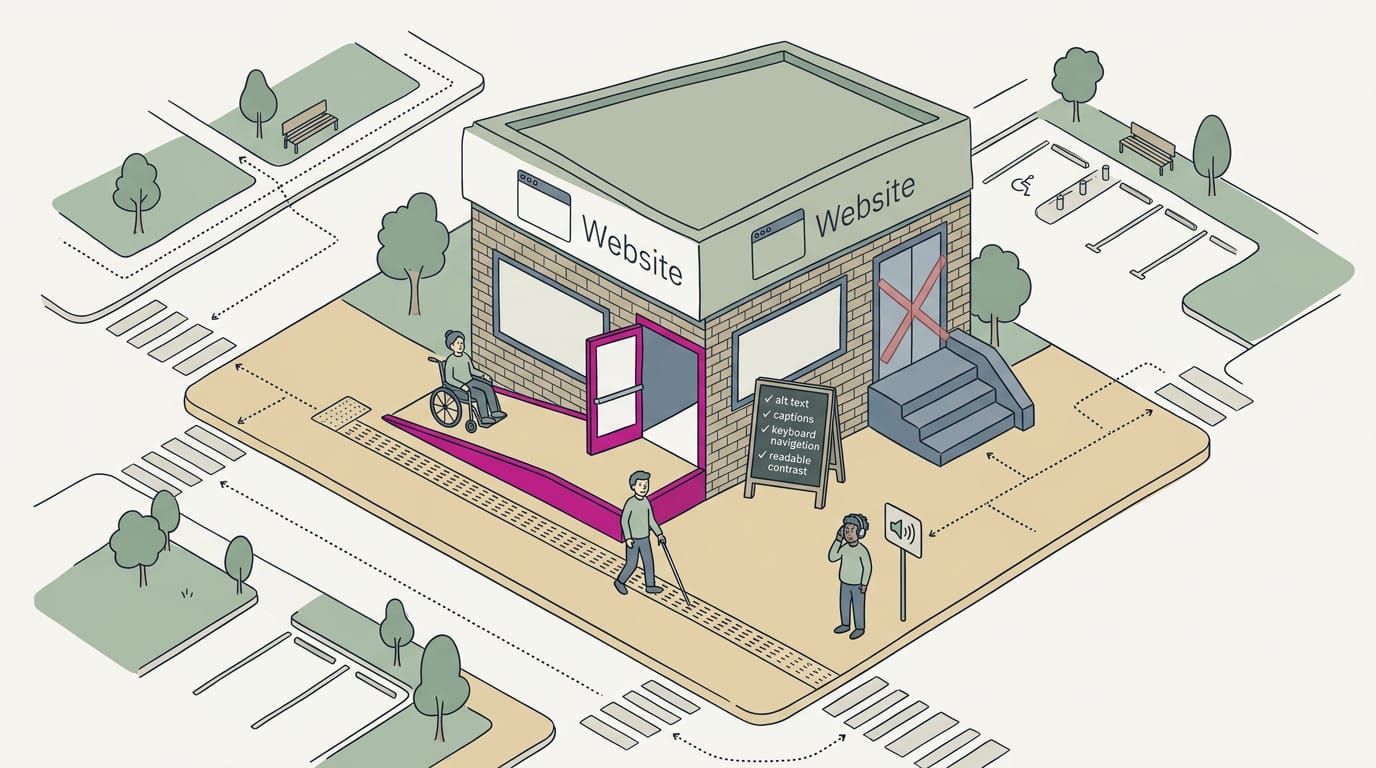
Picture a shop with a sticky door, hidden price tags, and a counter buried under boxes. Most people would walk right back out. Your website can have the same effect, except the customer never tells you why they left.
They just call the shop down the street.
Bad website design is anything that makes it hard for a visitor to find what they need, trust you, or take the next step. It’s rarely one big mistake. Usually it’s a handful of small ones that quietly add up to lost calls and empty booking slots.
Here, we’ll cover the common culprits, why they happen, and how to audit your own site so you fix the problems that cost you the most first.
Visual Choices That Signal Bad Website Design
Color, text, fonts, and layout do much of the talking before anyone reads a word. When they’re off, visitors leave without calling, and most fixes are simpler than you’d think.
Keeping a small, on-brand color palette
Too many colors make a site feel busy and bury the button you want pressed. Aim for a color palette of three to four:
- a main brand color
- an accent for buttons
- one or two neutrals
All pulled from your logo and signage.
Color psychology, the idea that colors carry feelings, is worth a light touch. Calm blues suit a dental office. Let color support your brand, not compete with it.
Making text easy to read for everyone
Text needs enough contrast ratio (the difference in brightness between text and its background) to read easily. The Web Content Accessibility Guidelines (WCAG) set minimum contrast ratios for that reason.
Low-contrast text is widespread. According to the 2026 WebAIM Million report, text below the WCAG 2 AA thresholds appeared on 83.9% of home pages, up from 79.1% in 2025.
Some visitors can’t tell certain colors apart, so pair color with a word or icon. A red dot alone is easy to miss, but the word closed isn’t. Test your main text and buttons with a contrast checker tool.
Choosing fonts people can easily read
Fonts set the tone but shouldn’t slow anyone down. For body text, choose a sans serif font (clean letters without decorative strokes at the ends). Small or decorative fonts slow reading, so save script or ornate styles for a logo or short headline.
Limit yourself to two fonts, one for headings and one for body, and keep body text readable on a phone. Font color clashes, like bright orange on light blue, make reading a chore.
Cutting clutter and walls of text
Prune anything that doesn’t help someone call, book, or find your hours. Think of a plumber whose homepage opens with several paragraphs of company history before the phone number appears. Someone with a leaking pipe shouldn’t have to hunt for the number.
Move the number and a short service list up top, and the call comes faster.
Give the eye room with white space, the empty area around text and images. Use short headings and paragraphs, and add a photo of your team or finished work to break up the text.
Lead with what visitors need, not how long you’ve been around, so prices and hours are easy to scan.
Making the reading order obvious and consistent
Good pages guide the eye without effort:
- Clear reading order. Arrange sections so the eye moves from headline to services to how to reach you.
- Consistent layouts and styles. Keep buttons, headings, and spacing the same on every page so nobody relearns your site with each click.
- Visuals aligned with purpose. A stock photo of a stranger beside your prices adds nothing.
- Incomplete, inconsistent pages. A mismatched font, a broken image, or an unfinished section makes a business look neglected.
Navigation and Making Content Easy to Find
Your menu is the first thing visitors use to judge your site. When it’s confusing, they leave before they call.
How confusing menus cost you visitors
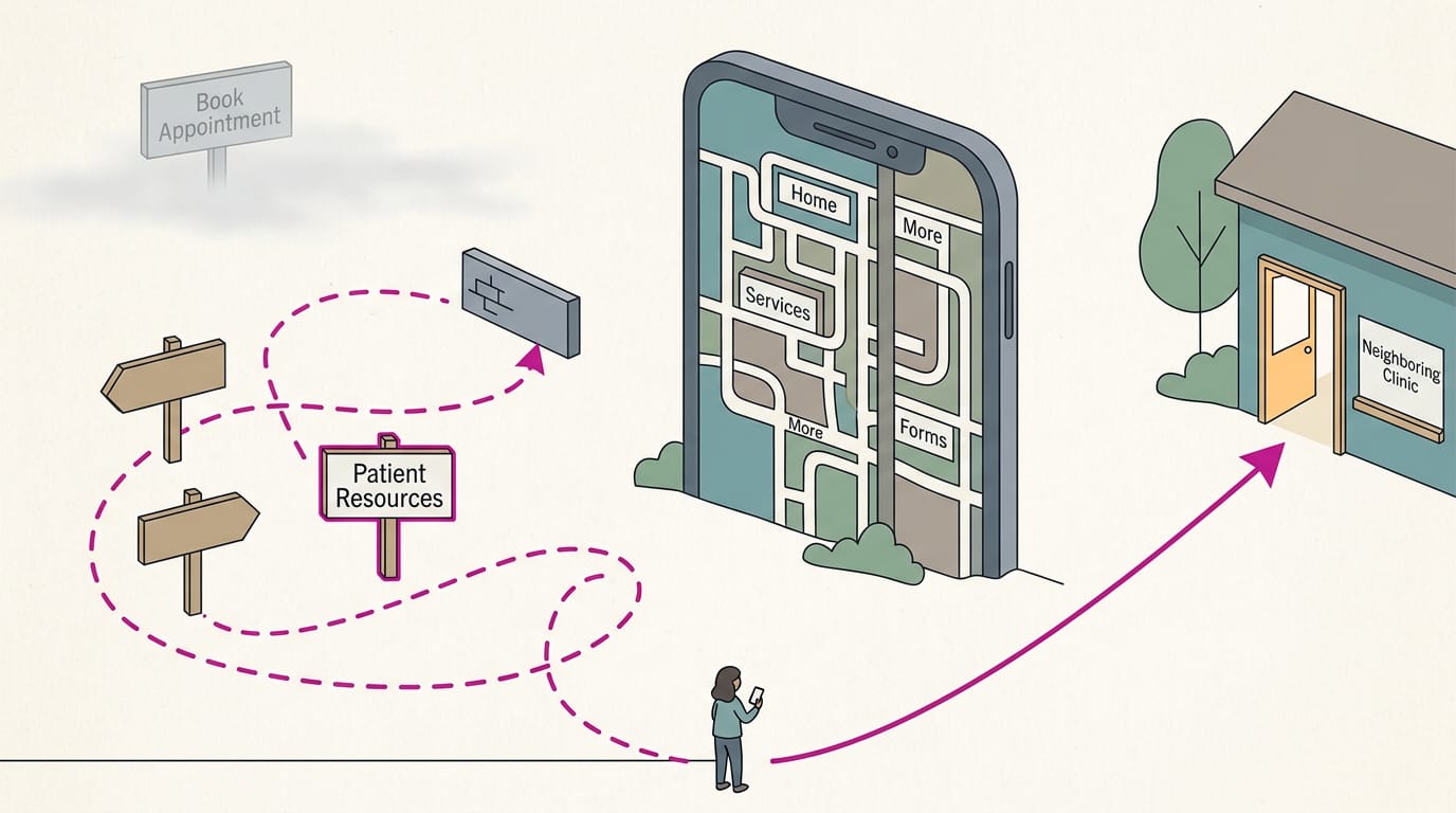
A dental office labels its booking page “Patient Resources.” A parent on a phone taps around, gives up, and calls the next clinic.
- Users can’t find information. Prices and hours get buried.
- Higher bounce rates. A bounce rate counts visitors who view one page and leave.
- Hurts search engine optimization (SEO) and trust. Search engines and visitors both struggle with cluttered sites, and trust drops.
Two causes drive this: bloated menus and unclear labels.
A pretty menu can still be bad strategy if booking sits three clicks deep. That’s a planning problem, not a design one.
Ways to make your menus clearer
Start with these fixes:
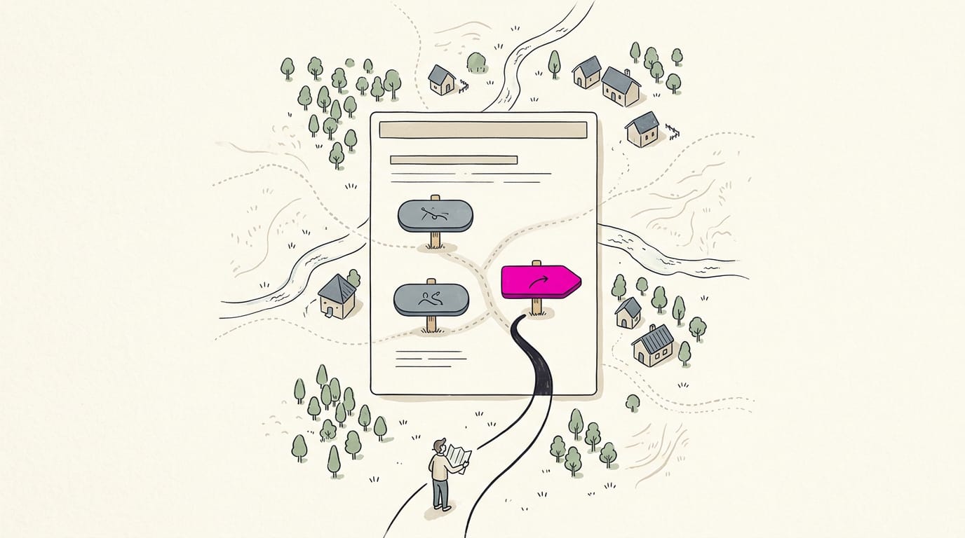
- Streamline your structure. Keep top-level items to a few and group the rest beneath them.
- Use descriptive labels. “Book an Appointment” beats “Get Started.”
- Add a sticky menu and search bar. Navigation stays on screen while people scroll, and search gets them there faster.
- Make the homepage easy to reach. Link your logo to it on every page.
- Check for broken links. Click each menu item this week and fix what’s broken.
- Make mobile menus touch-friendly. Buttons should be big enough for a thumb.
Helping visitors discover more content
Most visitors won’t dig for more on their own. It’s less about how you filed things and more about what they want next.
- Clear categories. Group pages by what visitors want to do, not your internal filing.
- Content recommendations. Add a “Related” box that points to the logical next step.
- Highlight recent or popular content. Feature your newest post or most-asked question on the homepage.
- Previews and visual cues. Pair each link with a short summary and a photo.
Make the next step obvious.
Slow Pages and Poor Mobile Responsiveness
A slow or cramped site loses people before they read your phone number.
Why slow loading hurts visitors and rankings
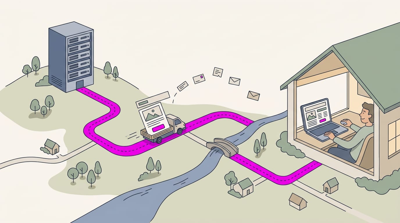
Slow pages push visitors away, raising your bounce rate (the share who leave without going further). Large images, ads, and scripts (extra code that adds features) are common culprits.
Think of a dental office with heavy photos, where a patient on her phone gives up and calls the clinic down the street.
Speed also affects rankings: Google says its ranking systems use Core Web Vitals, its speed and experience measures.
A systematic review of website performance research found that load time, page size, and response time were the most widely adopted benchmarks, appearing in more than 70% of studies.
Speeding up images, scripts and hosting
- Compress and optimize images. Shrink photos to the size the screen needs before uploading.
- Minimize HTTP requests. HTTP (HyperText Transfer Protocol) is how browsers fetch files, so every extra image, script, or widget adds a trip. Remove what you don’t need.
- Use a content delivery network (CDN) and caching. A CDN serves pages from servers nearer visitors, and caching reuses saved copies for repeat visits.
- Upgrade hosting. If your site stays slow after cleanup, a stronger hosting plan may be the fix.
- Test with PageSpeed tools. Run your homepage and booking page through one, then fix what it flags.
Why your site must work on phones
DataReportal’s global digital overview puts mobile phones at 52.6 percent of the world’s web traffic, so more than half of your visitors may be on a phone. It’s less about having a site and more about how it works in someone’s hand.
Good mobile pages use a fluid grid (a layout that stretches to fit any screen) and media queries (rules that rearrange the page for smaller screens). Make buttons big enough to tap with a thumb.
Test on real devices by booking an appointment start to finish. Mobile-friendliness can affect rankings too, and Google’s page experience guidance asks, “Does your content display well on mobile devices?”
Broken links, errors and server problems
- Broken links and error messages. A dead link or error message tells visitors nobody’s minding the store. Check your links and redirect old pages.
- Plugin and server problems. Outdated plugins (add-on tools) can conflict, and an overloaded server may time out.
- Coding and hosting issues. Small code errors or an unreliable host can make pages fail to load at random.
Trust, Security and Keeping Content Fresh
Before anyone calls or books, they’ve already decided whether to trust you. Security, freshness and design all shape that verdict.
Why HTTPS matters for visitor trust
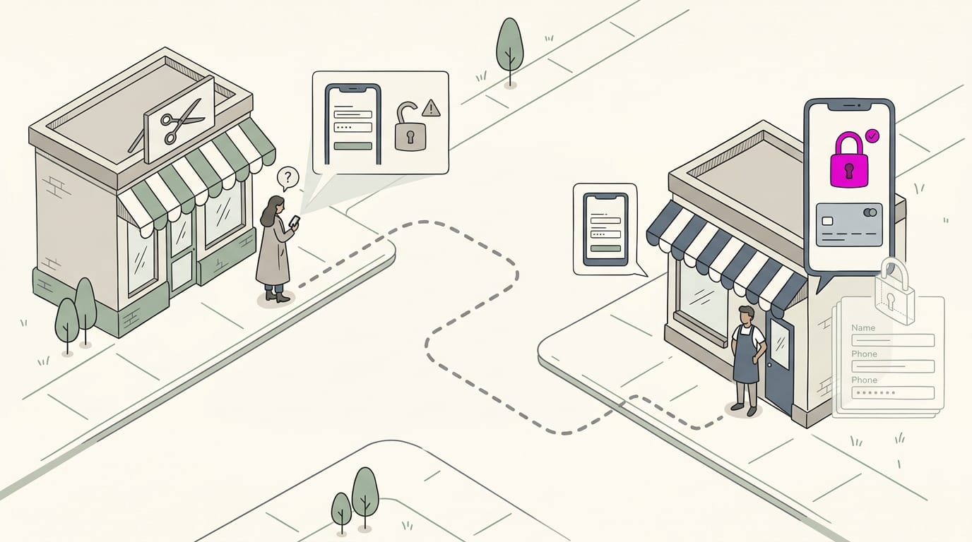
HTTPS (Hypertext Transfer Protocol Secure) is the encrypted version of your web address, switched on by an SSL certificate (Secure Sockets Layer). It matters most when you take bookings or payments.
Picture a salon owner whose booking page still loads without encryption. A client about to enter a card number sees no secure connection and books down the street.
Encryption also protects the names and phone numbers people type into your forms. It’s less about tech and more about trust.
When old design and content hurt credibility
Outdated pages erode credibility fast. A look that’s years old suggests nobody’s minding the store, so refresh your design as trends shift.
Review older pages on a set schedule. Evergreen content (services, directions, parking details) stays useful for years, so keep it accurate.
Stale details are easy for visitors to spot. Picture a dental office whose site still lists Saturday hours it dropped last year. A patient drives over, finds the door locked, and doubts everything else on the page.
Update hours, addresses and prices the day they change.
How your design builds or breaks trust
Visitors decide in seconds. According to Forbes Advisor’s website statistics, users form an opinion about a website in just 0.05 seconds, so your first screen has to work fast.
Consistency builds trust. When your logo, colors, phone number and hours match across your site, listings and signage, visitors stop wondering whether they’ve found the real business.
A messy look hurts perceived quality. Mismatched fonts, crooked photos and broken links can make skilled work look careless. Tidy beats flashy.
Your Message and What Visitors Do Next
A clear offer still needs a clear next step. Here’s how to build both into your site.
Making calls to action clear and clickable
A call to action (CTA) is the button that tells visitors what to do, like “Book a Visit.” Vague labels like “Submit” leave people guessing.
A button should invite a click, not just decorate the page:
- Visible: Light gray on white can nearly vanish, so pick a standout color.
- Clickable: It shouldn’t read like a plain label. Give it solid edges.
- Expected: “Book Online” should open the booking form, not the homepage.
Click-to-call buttons matter most on phones. Picture a plumber’s customer with a burst pipe at 9pm: one tap on “Call Now” dials your shop, while a plain-text number means copying it, switching apps, and dialing. Salons need the same for online booking.
Try two versions, like “Book Now” and “Check Availability,” and keep the one more people click. That’s an A/B test: comparing two versions to see which performs better.
Saying clearly what you actually offer
Plenty of homepages lead with a slogan and never say what the business sells. Visitors need to understand your offer before they trust anything else.
Name the service, area, and next step on the first screen. A dental office might swap its slogan for “Family dentistry, new patients welcome,” so a parent on a phone knows in seconds whether to call.
Rotating banners, called sliders, can bury your main offer, and moving text is hard to read on a phone. Show one clear message instead.
Comprehension comes before persuasion. Awards and friendly staff only help once visitors know what you do. Clarity first. Persuasion second.
Real Sites That Show Bad Website Design
Often the fastest way to spot a problem is on someone else’s screen. These patterns repeat, and each one costs you.
When homepages try to say everything
Your homepage has seconds to answer two questions: what do you do, and what should a visitor do next? Crowded sites stack too much content at once, burying those answers under competing calls to action (such as ‘Book now’), sale banners, and pop-ups.
Dense text with little spacing leaves the eye nowhere to land. Clear sites show one main next step, while crowded ones show everything. Picture a dental office whose homepage opens with a sale banner and a long history paragraph.
A parent on a phone at lunch calls the next practice instead.
Flashing animations and music that distract
Flashing, blinking animations and music that starts without asking send visitors straight to the back button.
Pulsing logos, shock-value visuals, and off-topic animated GIFs (small looping image files) add noise, and noise hurts usability, or how easily someone gets something done on your site. Motion should guide the eye, not compete with your message.
Think of a plumber whose page auto-plays a jingle while a warning banner blinks above the phone number. A homeowner with a leak, squinting through that noise, calls whoever shows up next.
Odd layouts that feel stuck in time
A narrow text column on a wide screen makes the eye work harder, and fixed backgrounds with odd scrolling can make the page feel broken. Early-2000s styling and an old copyright year in the footer tell visitors nobody’s been home.
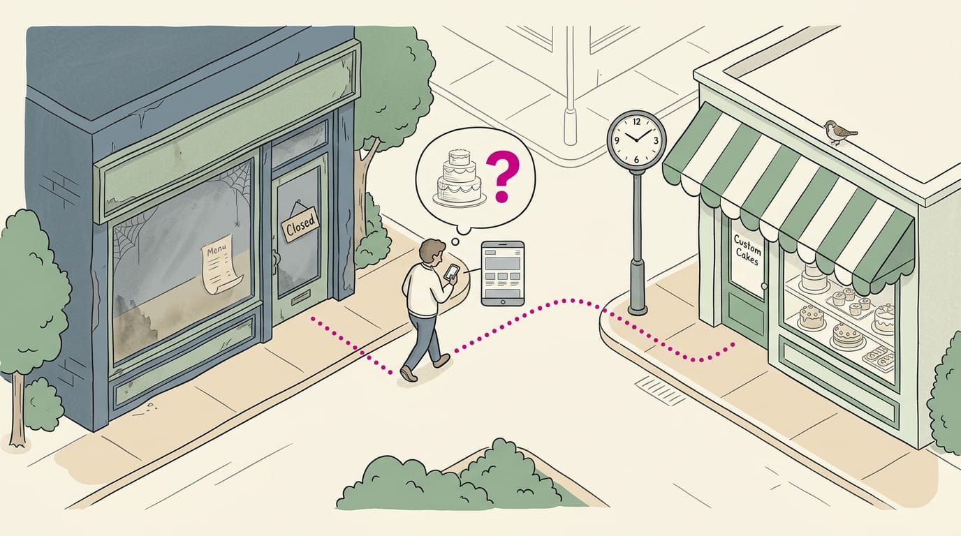
Think of a bakery whose site still shows last season’s menu. A customer wondering about custom cake orders assumes it’s closed and orders elsewhere. Your site should feel current, not archived.
Clashing colors that make text unreadable
The wrong pairing makes words vanish. Light grey text on a pale photo, or bright text over a busy pattern, forces squinting. Many simply leave. The key measure is contrast, the difference in brightness between text and whatever sits behind it.
Rainbow colors behind a paragraph look playful but turn reading into a chore. Menu links placed over a photo can blend right in, so visitors can’t find their way. Consider a hair salon whose services menu sits in yellow over a striped background.
A client checking prices on a small screen books with the salon down the street. Aim for colors that make words easier to read, not colors that make the page louder.
Small usability slips that lose sales
Small slips add up quietly, and each one can cost a sale:
- Unclickable images. A product photo that looks tappable but isn’t, like a book cover, stops the sale cold.
- Store links to the homepage. A ‘Buy’ link that lands on your front page makes shoppers hunt again.
- Buried updates. Holiday hours or a closure notice three clicks deep might as well not exist.
- Products too small to see. Tiny photos make people guess what they’re buying.
Picture a hardware store whose faucet part photo is too small to read and whose link goes to the homepage. The customer who needed it today calls across town.
Sites people often cite as examples
When people talk about bad design, the same sites tend to come up, including:
- Ling’s Cars
- Yale School of Art
- Suzanne Collins’ site
- Ford
- Goodreads
- Daily Mail
- Blinkee
- Patimex
- Penny Juice
Browse a few with these patterns in mind, and you may start to notice the same problems. Then turn that same eye on your own site, where we’ll head next.
Business Costs and How to Fix Them
Bad design costs calls and bookings in ways you can count.
How bad design hurts revenue and rankings
- Lost leads and conversions. A study of landing page design and structure, based on 25,027 landing pages, examined how design affects conversion, the moment a visitor calls, books, or buys. Poor design can make that harder.
- Higher bounce rates. When visitors leave after one look without clicking anything, that’s a bounce. Confusing layouts make it more likely.
- Lower search rankings. Slow, cluttered pages can also cost you visibility in search.
- Revenue left on the table. Picture a dental office with its booking form buried at the bottom. The patient checking from the parking lot books across town instead. That’s money walking out the door.
What makes a website effective?
An effective website is less about looking impressive and more about helping visitors act.
- Make the next step obvious. Put one clear action, like “Call now,” where visitors look first.
- Design for scanning. Clear headings and short paragraphs help visitors find your number at a glance.
- Test and refine continually. Have a newcomer try to book, and note where they hesitate. Then check your number, next step, and load time on your phone.
- Redesign case studies. They often focus on clarifying the next step and easing scanning. A case study of a web interface redesign says content must “facilitate scanning” so readers can take in large portions at a glance.
- Agency services pitch. Agencies can help with a rebuild, but you don’t need one to start. Ask which fix they’d tackle first.
- Cost of a good website. Price depends on scope, and we don’t have a verified figure, so ask for a quote that itemizes each fix.
For the five golden rules of web design, the first three above are the ones that move calls most.
Bad website design rarely announces itself. It hides in a cluttered homepage, a menu nobody can find, a slow page on a phone, or a form that asks for too much.
You don’t need a full rebuild to fix most of it, so start with the problems closest to your phone and your calendar.
This week, grab your phone and try to book or call from your own site. Note the first snag you hit and fix that before anything else. You’ll spot problems you’ve stopped noticing.
Every snag you clear is one more customer who makes it to your counter.
References
- Predicting Website Performance: A Systematic Review of Metrics, Methods, and Research Gaps (2010–2024) — doi.org (2025)
- The effect of landing page design and structure on conversion rates — doi.org (2025)
- A Case Study of the Effects of a Web Interface Redesign Based on Usability Guidelines. — dc.etsu.edu (2011)
- Understanding page experience in Google Search results — developers.google.com (2026)
- Digital Around the World — DataReportal — datareportal.com
- Top Website Statistics for 2025 — forbes.com
- WebAIM: The WebAIM Million - The 2026 report on the accessibility of the top 1,000,000 home pages — webaim.org
Questions
What are the five golden rules of web design?
Five useful rules are: make the next step obvious, design for easy scanning, keep navigation clear, make the site readable and usable on mobile, and test and refine it regularly. These principles help visitors find what they need and take action.
What are the 5 major components of a web page?
The five major components of a web page are the header, navigation menu, main content area, sidebar, and footer. Their exact layout can vary depending on the page’s purpose and design.
How much does a good website cost?
A good website’s cost depends on its scope, features, and the work needed. Ask for an itemized quote so you can see what each part of the project or each fix will cost.
What makes a website effective?
An effective website helps visitors quickly understand what you offer and what to do next. Clear navigation, scannable content, readable mobile-friendly pages, and a prominent action such as calling or booking make that easier.
Sources
- Predicting Website Performance: A Systematic Review of Metrics, Methods, and Research Gaps (2010–2024), doi.org,
- Digital Around the World — DataReportal – Global Digital Insights, datareportal.com
- Top Website Statistics for 2025 – Forbes Advisor, forbes.com
- Understanding page experience in Google Search results, developers.google.com,
- The effect of landing page design and structure on conversion rates, doi.org,
- A Case Study of the Effects of a Web Interface Redesign Based on Usability Guidelines., dc.etsu.edu,
- WebAIM: The WebAIM Million - The 2026 report on the accessibility of the top 1,000,000 home pages, webaim.org