Call to Action Marketing: Meaning, Types, and Results
Call to action marketing shows how to word, place, and test requests that turn customer interest into calls and bookings across ads, sales, and email.

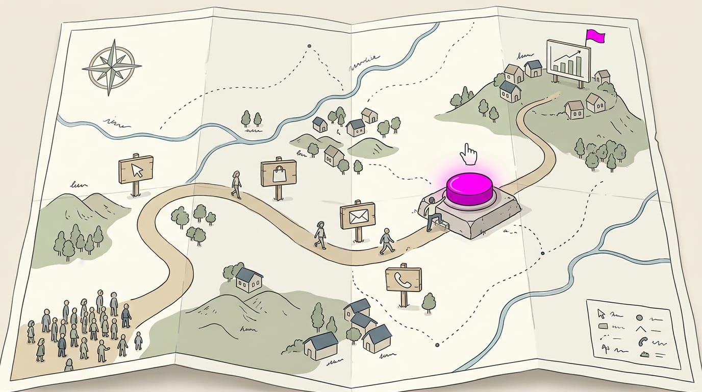
Call to action marketing is the planned use of clear prompts that tell people what to do next, such as calling, booking, buying, or getting directions. Choose one specific action, match the wording to what people need and how ready they are, and make the next step easy to see and complete across each channel. Track calls and bookings, test one change at a time, and keep the prompts that turn interest into action.
Think about the last time a sign said “Ask us about same-day appointments” and you actually walked in. That’s the power of a call to action (CTA): the clear request that tells people what to do next, like call, book, or get directions.
Without one, even a great shop or service van can leave customers guessing what to do next. In this post, we’ll cover what CTAs are, the main types, how to word, place, and test them, and how to count the results in calls and bookings.
What Call to Action Marketing Means
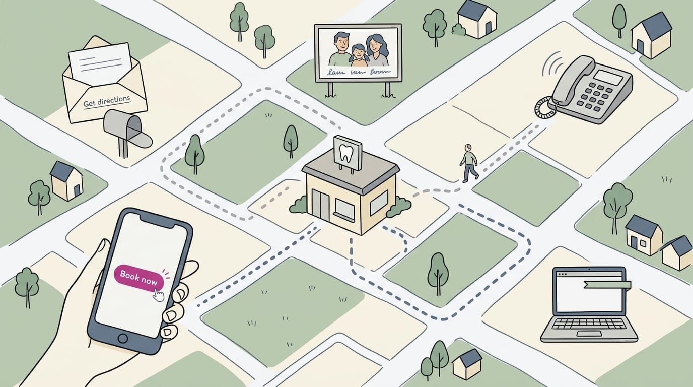
A call to action (CTA) tells people what to do next. Call to action marketing means planning those prompts on purpose.
What a CTA asks people to do
A strong CTA asks for one specific response, like “Call for a quote” instead of “Contact us.” It can be text, a button, or a graphic. It drives immediate action and guides the next step. Keep it to one ask, not everything at once. Clarity wins.
Where you’ll find CTAs
They show up wherever people see or hear your message:
- Websites and landing pages (single-offer pages): a clear button near the top.
- Emails and subject lines: “Reply to book your spring tune-up” sets up the ask early.
- Social media and ads: a closing line like “Call before Saturday fills up.”
- Brochures, catalogs, and flyers: a “Scan to book” line on the printed page.
- Blogs and whitepapers (longer, downloadable guides): a closing link to your booking page.
- Sales scripts: what your front desk says on the phone.
Consider a bakery owner whose flyer and phone greeting both end with “Order your holiday cakes by Friday,” so customers don’t get mixed messages.
Everyday CTA wording like Buy now
Good wording starts where the reader stands. “Buy now” and “Sign up” suit people ready to commit, while “Learn more,” “Download,” and “Subscribe” suit people still exploring. “Free trial offers” and “Book a demo” suit people who’d rather try first.
For local visits, try “Call now,” “Get directions,” or “Book online.” Pick words that match the reader’s readiness, not your eagerness to sell.
Why CTAs matter for conversions
A conversion rate is the share of visitors who take the action you want, like calling or booking. A clear CTA boosts that rate by guiding the customer journey from first glance to decision and removing confusion and guesswork.
Curiosity fades fast, so a CTA turns it into action while it lasts. Prompts like “Text us your questions” also build customer relationships.
Picture a hair salon whose visitors read three color pages and never book. Adding “Book your color appointment” to each page gives them the next step, so more of those readers book.
Interest is common. Action is what counts.
Different Kinds of CTAs You Can Use
A call to action (CTA) is the nudge that tells someone what to do next. The 3-3-3 rule is a simple guideline built on the number three: keep your asks few and clear so people know what to do.
Types based on their format
The format decides how people see the ask, while the words decide what they do. Here are the common formats:
- Button CTAs: a tappable box like “Book now.” A dental office’s “Book a cleaning” button lets a patient on a phone schedule in one tap.
- Text and link CTAs: a plain line like “Get directions,” handy in emails and listing descriptions.
- Image CTAs: a clickable photo with the ask printed on it.
- Audio CTAs: a spoken prompt, like “press 1 to book” on your phone line.
- Pop-ups and banners: a strip across your site announcing an open slot. Use these sparingly so they don’t get in the way.
Types based on your goal
- Lead generation: asks for contact details in exchange for something useful, like “Request a quote.”
- Sales closing: asks for the purchase right now, like “Book your appointment today.”
- Navigation: moves people to where they need to go, like “Get directions.”
- Interaction and sharing: invites engagement, like “Leave us a review.”
A salon owner’s listing with a booking button and a “Get directions” link gives a client who’s already decided two quick paths: book or find the door.
Direct asks versus softer, indirect nudges
- Immediate purchase requests: “Book today,” best when the reader is already sold.
- Emotional (pathos) appeals: messages that speak to feelings, like a tire shop’s “Keep your family safe on the drive home.”
- Brand loyalty outcomes: invitations to come back, like “Join our rewards list.”
- Small step-by-step CTAs: a low-commitment first step, like “Save our number,” that leads to a bigger ask later.
Direct asks suit readers who are ready, while softer nudges suit those who are still deciding. When in doubt, ask plainly.
How old-school and digital CTAs compare
- Mail-in order forms: a printed form customers mail back. The digital version is the online booking form.
- Catalogs and magazines: a printed phone number or coupon code readers must write down. A bakery’s printed coupon can become an “Order cake” button on its listing.
- Hyperlinks and clickable buttons: a link that takes readers straight to the next page, so one tap replaces the pen and paper.
- Same basics, new medium: whatever the channel, a good CTA still needs a clear verb, one ask, and an obvious next step.
What Makes a CTA Work
A strong call to action (CTA) tells people what to do next and makes doing it easy. Most weak ones fail for simple, fixable reasons.
Tell people exactly what to do
Picture a plumber’s site. The weak CTA, “Discover our range of comprehensive plumbing solutions,” makes visitors work out their next step. The strong one, “Call for same-day leak repair,” hands it to them.
Four habits get you there:
- Clear action verbs. Use “call,” “book,” or “get directions,” not “learn more.”
- Concise wording. Short wins. Three to five words usually do the job.
- Avoid unnecessary detail. Save your history for the About page.
- Obvious next step. Put the phone number or button where the eye lands first.
Give people a reason to act now
Real urgency gives people a push, but invented urgency erodes trust. Limited-time offers give people a date to act by.
Limited supplies work when they’re true: a restaurant with four tables left Saturday night can say “Reserve before Saturday’s gone,” which gets undecided diners booking now. Fear of missing out (FOMO) adds pressure, so keep it accurate.
Special deals, like a first-visit discount, give hesitant newcomers a reason to try you now.
Show the value and remove risk
Every visitor is asking, “What’s in it for me?” Your value proposition answers that in the CTA itself, and “Call for a free estimate” beats “Call us” because it names what they get. Risk matters too.
“No obligation” tells people the call commits them to nothing, and a free trial or refund belongs right in the CTA.
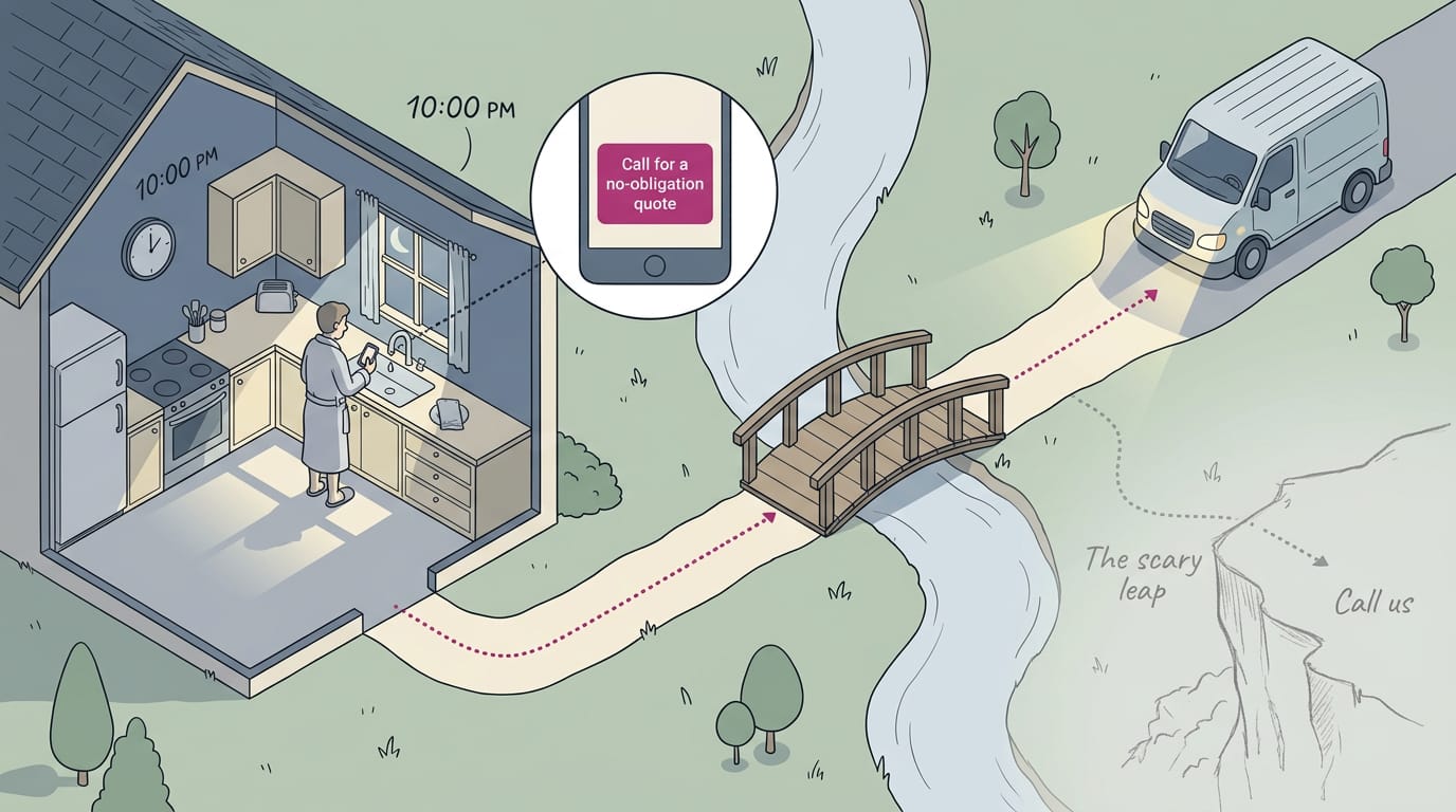
Consider a homeowner with a dripping faucet at 10pm. “Call us” asks for a leap of faith, but “Call for a no-obligation quote” makes dialing feel safe.
Stand out, stay relevant, sound consistent
Make the button look like a button: a contrasting color, big enough to tap on a phone. Match the ask to where the visitor is. A services-page reader is ready to book, but a first-time visitor may only want directions.
Let the CTA sound like your shop: “Ask us about cakes” beats “Submit a service inquiry.” Think of a bakery that moves “Order a birthday cake” from the footer to the top of its homepage.
Customers planning a party can order without scrolling. Make it impossible to miss.
Best Practices for Improving Your CTAs
A call to action (CTA) is the button, phrase, or prompt that tells someone what to do next. The best ones get tested, placed well, and kept fresh. We’ll show you how.
Try two versions and keep the winner
Change one thing at a time and compare two versions over the same stretch. Start with what’s most likely to matter:
- Copy. Try ‘Book a visit’ against ‘Learn more.’
- Color and size. These decide how easily a button gets noticed.
- Placement. Test a button near the top of the page against one at the bottom.
Picture a bakery testing ‘Order your cake’ against ‘Contact us’ for two weeks. Keep the winner, then test the next idea. That’s iteration: small, steady wins, not one big redesign.
Watch out for common mistakes: changing several things at once, ending tests too early, and vague wording like ‘Submit.’
Where to place CTAs on each channel
Each channel has its own sweet spot:
- Blog posts. End with one clear next step, like a booking button.
- Landing pages. Put your main CTA above the fold, the part visible before anyone scrolls. One primary CTA per page keeps choices simple.
- Emails. Use a button, not a plain text link. Buttons are easier to spot and tap.
- Paid ads. A dynamic CTA changes its wording based on the viewer, such as ‘Book now’ for a returning visitor.
- Email subject lines. Work a CTA into the subject, like ‘Reply to book your spring tune-up.’
- Map listings and website headers. Your call, booking, and directions buttons are the first things people see, so set them up first.
Making CTAs work well on phones
Picture someone with a leaky ceiling searching ‘plumber near me’ at 9pm. If your button is hard to tap, they’ll tap the next plumber.
- Responsive design. Your page adjusts to fit any screen.
- Large tappable buttons. Big enough for a thumb, with room around them.
- Short forms. Ask only for what you need.
- Sticky CTAs. The button stays in reach as people scroll.
- Fast load times. A slow page loses people before they see the button.
Tailoring CTAs with customer data and AI
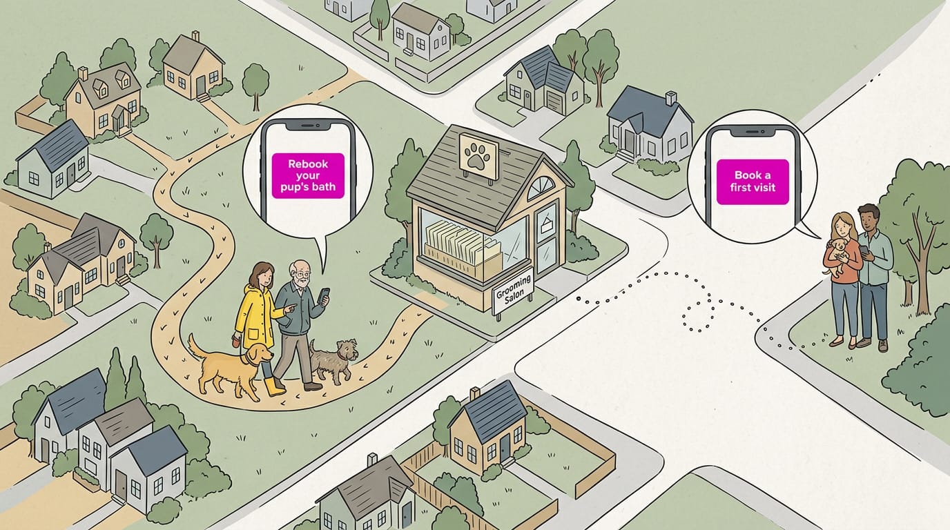
Segment-based CTAs show different buttons to different groups. A dog groomer might show ‘Rebook your pup’s bath’ to past clients and ‘Book a first visit’ to newcomers, so regulars don’t get a stranger’s pitch.
Your customer history makes this possible. A customer relationship management (CRM) system keeps it organized, though a spreadsheet works to start.
Artificial intelligence (AI) tools can predict which CTA a customer is most likely to respond to, and real-time adjustments swap CTAs as new information comes in. Use these only if your software includes them.
The who sees the button matters as much as the what it says.
Track whether CTAs actually bring results
Measure what happens after the click. Three numbers matter most:
- Click-through rate: the share of people who see a CTA and click it.
- Conversion rate: the share who take the action you want, like booking.
- Bounce rate: the share who leave a page without doing anything.
Track user responses too: ask callers how they found you and what made them dial.
Clicks are a signal. Calls and bookings are the result, so count those, not clicks.
Keeping CTAs fresh as audiences shift
Adapt to current events: if a storm is coming, a heating company might switch its header to ‘Book a furnace check’ for the week.
Follow what your audience cares about. If callers keep asking for Saturday hours, put ‘Book a Saturday slot’ in your CTA.
Refresh on a set schedule, like every season. Stale buttons get ignored.
Using CTAs in Ads, Sales and Email
Every sales talk, ad, and email needs a call to action (CTA), the step you want people to take next.
Sales scripts and response-driven ads
Scripts give your rep a clear next step, like “Shall we book you for Thursday at 10?”
Try a series of small asks, not one big one: “Want the price list?” then “Shall we hold a slot?”
Closing the sale is your last CTA. A plumber who ends a quote with “Can we be there Tuesday morning?” leaves one easy yes.
TV ads don’t give you much time, so keep the CTA short and on screen.
Match each CTA to the need and count the results:
- Call for urgent jobs, like a burst pipe.
- Quote for bigger jobs people compare first.
- Visit for walk-in businesses, like a salon or restaurant.
Getting CTAs right in your emails
Your subject line can carry the CTA too: “Book your spring tune-up this week” says it before they open.
Give value quickly, before the ask: a seasonal tip or a note about their next visit.
Cold emails go wrong in a few common ways:
- Too many asks. Three requests at once leave readers stuck.
- A vague ask. “Any thoughts?” gives no next step.
- Talking only about you. Lead with their needs.
How well-known brands use CTAs
Netflix’s CTA is a free trial, and Spotify’s is a free tier. It’s a small first step either way.
Software sellers for small businesses use the same idea: a demo is a smaller ask than a purchase.
Borrow that for your shop: a salon’s free consultation or a plumber’s free estimate is a small yes. Make the first yes easy.
A good call to action doesn’t have to be clever. It has to be clear, specific, and easy to act on, whether that means a phone call, a booking, or directions.
Pick the one step you want customers to take, say it plainly, and put it where people are already looking.
Then keep score. Count the calls and bookings each one brings in, change one word at a time, and keep what works. Make the next step obvious, and more people will take it.
Questions
What is a call to action in marketing?
A call to action (CTA) is a prompt that tells someone what to do next, such as call, book, or get directions. In marketing, it guides people toward a specific action with clear wording.
What is the 3-3-3 rule in marketing?
The 3-3-3 rule in marketing is an informal guideline for keeping marketing requests few and clear so people know what to do. For a CTA, focus on one specific action and make the wording concise; the rule does not have one universally standardized formula.
What is an CTA example?
A CTA example is “Book your appointment today.” It gives a clear action and tells the reader what to do next.