Y2K Design Explained: Look, History, and How to Use It
Y2K design revives bubbly type, chrome, and icons. See how to bring its throwback look to signs, menus, cards, and flyers without a time-capsule feel.

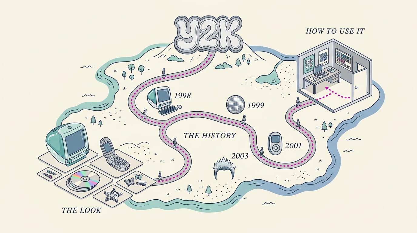
Y2K design is the bold, playful visual style of the late 1990s and early 2000s, recognizable by bright colors, chrome and translucent finishes, bubbly type, and nostalgic digital details. Use these elements as focused accents, such as a glossy headline or sticker-like icon, while keeping important text, prices, and contact details clear and easy to read. The style can attract attention and add personality, but restraint and usability help it feel welcoming rather than like a time capsule.
Remember the chunky flip phone, the translucent case on your first gadget, or the bubbly stickers on a school binder?
Those things share a whole visual style, called Y2K design (short for the year 2000, the look of the late 1990s and early 2000s), and it’s making a comeback.
In this post, we’ll cover where the look came from, its signature visuals and type, and the icons and details that make it recognizable.
Then we’ll show you how to use it on signs, menus, cards, and flyers without making customers feel like they’ve wandered into a time capsule.
What Y2K Design Is and Its Origins
Y2K design is named for the year 2000, or “Y2K” for short, and borrows the bold, shiny look of the turn of the millennium.
Where the Y2K name came from
The name comes from the millennium bug, a flaw in older software that stored years with only two digits. Programs might read “00” as 1900, throwing off dates. Teams raced to fix the code before the clock rolled over.
The term outlasted the deadline. It moved from IT departments into everyday talk, then into design. So what is Y2K design? It’s a visual style that mixes retro tech imagery with playful pop-culture color, and you’ve probably seen it before.
Eras and pop culture behind the look
The look grew out of the late 1990s and early 2000s, a time when tech seemed to be racing toward the future. It drew on a few sources:
- Tech optimism and futurism. Gadgets had silver casings and blinking lights, as if the future was arriving next week.
- Early mainstream internet. Dial-up sounds and bubbly fonts set the tone.
- Rave, hip-hop, and sci-fi. Neon and glitter from club flyers met chrome and starfields.
Maximalist, glossy and endearingly cheap
Y2K design is maximalist and over the top, piling on patterns, colors, and effects. Surfaces look glossy, digital, and spacey, with chrome and lens flares.
The feel is cheap but endearing: clip-art stars, WordArt, and drop shadows look homemade, and that’s part of the charm. Minimalism asks what you can remove. Y2K design asks what else you can add. It’s loud on purpose.
Picture a bubble tea shop owner who wants a sign that stops teens mid-stride. A chrome border, a starburst, and a bubbly font can do that, and a group that snaps a photo of it has already noticed the shop.
The Signature Visuals Behind the Look
The Y2K look (short for the year 2000 problem) rests on a handful of repeating ideas. Here’s what each looks like and how to use it without hurting readability.
Color palettes from pink to icy blue
Color does most of the work. Your main options:
- Bubblegum pink and orange: playful, bright pairs for dessert and family spots.
- Icy blue and pastels: cool, soft tones that feel clean and calm.
- Neon and candy brights: saturated colors that grab attention fast.
- Silver and metallic accents: a sheen that makes any palette look finished.
- Monochrome option: one hue in several shades for a quieter look.
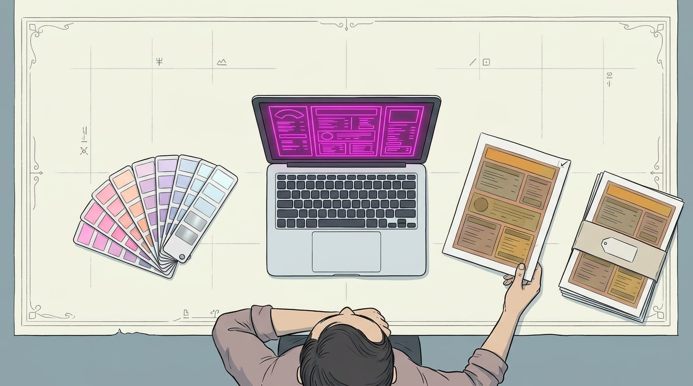
Neon colors shift from screen to print, so a glowing pink on your laptop can print flat. Think of a bakery owner whose orange menu board turns muddy on paper.
Order one proof before you print 200 copies, and keep neon as an accent rather than the background.
Mesh gradients and oil-spill color blends
Mesh gradients blend one hue into the next like a soft, blurred backdrop. Oil-spill multicolor blends swirl bright colors with an iridescent sheen, and holographic pastel backgrounds add a shimmering wash of soft tones.
A yoga studio could set its class schedule on a soft gradient, with the times on a solid panel so the swirls never fight the words. It’s easy to overdo a blend.
Shiny chrome and see-through plastic surfaces
Chrome and metallic finishes add a polished edge to logos and borders. Translucent plastic and vinyl look like see-through colored shells, while holographic and glitter finishes catch light as people walk by.
iMac-style materials borrow the candy-colored, rounded look of that era.
Consider a car wash with a chrome-edged logo on its window vinyl. The shine catches drivers’ eyes, while the price list stays plain black.
Use shine as trim, not the whole sign. Check which finishes your printer offers before you design around them.
Inflated blobs, bubbles and pill buttons
Blobjects are rounded, amoeba-like shapes, and blobitecture applies those soft, bulging forms to buildings. Gel buttons are glossy pill shapes with a bright highlight on top, and 3D inflatable shapes look puffy, like balloons.
Bevels give edges a raised, sloped look, and soft shadows lift elements off the page.
A pizza shop owner could make the ordering prompt a glossy pill button, so customers spot the next step at a glance. Give that button the shine, and keep everything else flat.
Glowing, glitchy and futuristic effects
Neon glow is a soft halo around text or lines. Glitch effects and scan lines add horizontal stripes and digital distortion, like an old tube TV.
Wireframe grids outline a 3D shape with thin lines, and space and hologram elements bring in stars, planets, and shimmer.
A barbershop might give its name a neon glow but keep the hours in plain black, so the times stay easy to read from the sidewalk.
Save the glow for the headline, not the fine print.
Type Styles That Mark the Era
Type does much of the work in this look, so choose it carefully. Here’s how to pick styles that feel like the era without hurting readability.
Fonts from WordArt to pixel and techno
Five styles cover most of the look:
- WordArt-style decorative type: Curvy, outlined letters with a bit of swagger. Best for headlines, rarely for paragraphs.
- Pixelated bitmap fonts: Letters built from visible square dots, like an old arcade screen.
- Techno and sci-fi fonts: Squared-off, angled letters that suggest a future that now feels nostalgic.
- Rounded sans-serifs: Soft-cornered, friendly letters that feel approachable.
- Chunky 3D lettering: Thick letters with a visible side, so they seem to pop off the page.
Match the style to what you sell. A pizza shop might use chunky 3D letters on a weekend deal sign so it catches eyes from the sidewalk, while a phone repair kiosk could use techno type to match its gadgets.
Using retro type without hurting readability
Here’s the catch: the more decorative a font, the harder it is to read at a glance. Use retro type for attention rather than information.
- Bold fonts with textures: Good for one eye-catching word. Keep textures light so letters stay crisp.
- Display fonts for headings only: Save the decorative style for the shop name or a headline, never a full menu.
- Readable fonts for body copy: Use a clean, simple face for prices, hours, and details customers need to read from a few steps away.
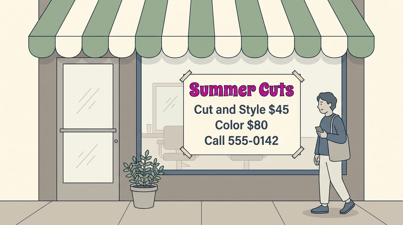
Consider a salon owner whose flyer has a textured “Summer Cuts” headline, with prices and the phone number in a plain font. Customers get the look and the details they need to book.
Style gets the glance. Readability gets the call.
Images, Icons and Graphic Details
Imagery is where the Y2K look shows its personality most clearly. Here’s what you can borrow without overwhelming customers.
Stars, hearts and sticker-style icons
Stars, hearts, and butterflies are signature shapes, often glossy and scattered like confetti.
Pixel and bitmap icons (images built from a grid of dots) use chunky squares, while sticker packs add thick white borders that make icons look peeled off a sheet. Flip phones and compact discs add cheerful, nostalgic cues.
A nail salon owner puts sticker-style stars around her booking number on a flyer, so it’s the first thing people read on a crowded board.
Grainy flash photos and lo-fi graphics
Lo-fi (low-fidelity) means rough and deliberately imperfect. Flash photography adds harsh light and grain, and fisheye distortion bends a frame’s edges so people look curved. Cutout people are figures pasted onto bright scenes.
Microsoft Paint-style graphics and pixel art add crude charm, and GIFs (short for Graphics Interchange Format) bring motion. The roughness is the point, not a flaw.
A bakery owner posts a grainy flash photo of pastries with a cutout sticker of herself, which reads as personal and playful.
Neighboring styles and how they differ
Here’s how these nearby looks differ:
- Cybersigilism uses sharp, glowing angles and symbols.
- Neo-tribal borrows bold, flowing patterns.
- Streetwear uses bold, logo-driven graphics.
- Racing badges use shields, stripes, and numbers.
- Halftone builds images from dots, while brutalist shapes are blocky and raw.
- Kawaii is soft and rounded, and anime brings big expressive eyes.
- Retro computer windows copy old desktop title bars.
The one to keep straight is Frutiger Aero. Y2K leans on hard edges and bright contrast, while Frutiger Aero goes for glossy, nature-filled surfaces like bubbles and sky. Keep text readable, too. Two or three elements are plenty.
Why Y2K Design Is Popular Again
Y2K design, the look of the early 2000s, is back, and we’ll explain why before you borrow it for your signs and menus.
How nostalgia drives 20-year trend cycles
A new analysis of more than 150 years of women’s clothing, reported by Scientific American, found that hemlines, necklines, and waistlines of dresses tend to become cool again about 20 years after their last turn.
That’s the 20-year trend cycle at work. Nostalgia is what keeps it turning.
Gen Z adds another layer. Many of them were too young to remember the first time around, so these looks feel brand new to them.
Millennials grew up with these looks, so they often feel a warm pull toward them. Familiar designs signal comfort, and that feeling is hard to fake.
There’s an emotional pull too. When the future feels uncertain, people often reach for something lighter. Bright colors and playful shapes offer a small, friendly escape.
Nostalgic looks that still sell well
Y2K looks work as visual shorthand. Glossy plastics, translucent colors, and chrome-style accents tell people what era they’re looking at right away. On a sign, that quick read is a real advantage.
According to Lost Touch?, a research paper on Y2K-era screen devices, Y2K-inspired design draws on nostalgia while keeping things usable. That means a throwback can charm without getting in the way.
The question isn’t whether a design looks retro. It’s whether it helps customers act: call, book, or walk in. Think of a dry cleaner who swaps a plain sign for a glossy, bubble-lettered one but keeps the phone number large.
Passersby notice the look, and they can still read the number from the curb.
Bringing the Y2K Look into Modern Work
Is Y2K right for your brand? The Y2K look (the bold, glossy style of the turn of the millennium) suits a streetwear shop or a retro café better than a dental office. Here’s how we’d use it well.
Using it on websites and app screens
Y2K ideas work best as accents rather than full layouts. On your user interface (UI), a deliberately dated touch, like a chrome-edged button or a glossy call to action (CTA) card, adds personality without taking over.
Browse a few retro-styled sites for ideas, then borrow only what fits.
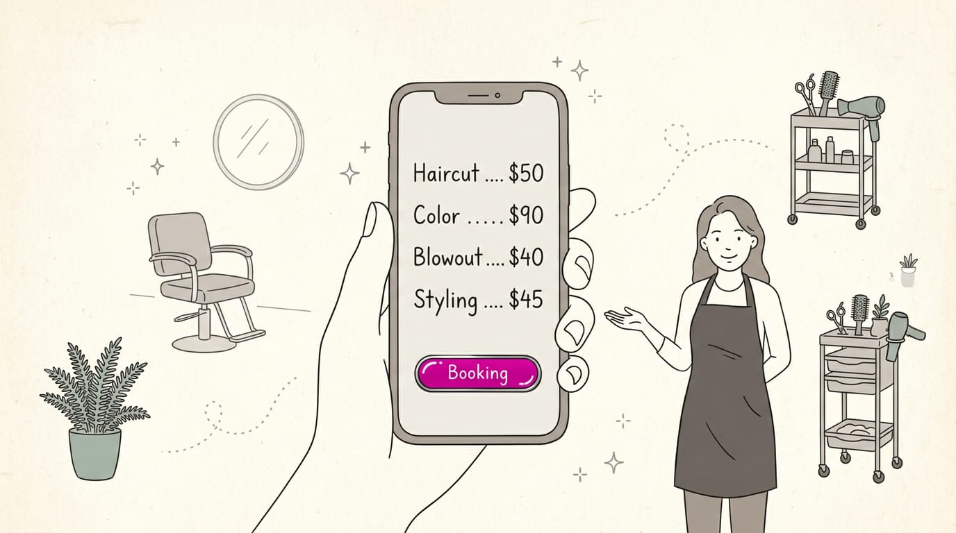
Think of a salon owner who makes just her booking button glossy and keeps the rest plain. Clients spot it fast, and the prices stay easy to read.
Keeping style and usability in balance
- Readability and contrast. Pastel or neon text on glossy backgrounds can vanish, so keep body text dark on light.
- Targeted effects only. Save shine and animation for a headline or a single button.
- Accessibility and SEO. Search engine optimization (SEO) and screen readers both need real text, so add alt text (a short image description) to every picture.
- Fast load and mobile. Heavy images slow phones, so compress every file.
- Avoiding a dated, cheap look. Aim for nostalgic rather than cheap. Restraint wins.
Branding and print, from logos to menus
A Y2K logo works when it stays simple enough to shrink onto a receipt. Posters, album covers, streetwear, and social media banners are where the bold style shines most. Window graphics and menus are the easiest starts.
Consider a bakery owner who adds a bubble-letter decal to her front window and keeps her hours in a plain, high-contrast font. Keep prices and hours highly legible, because those are the details customers come for.
Tools and Assets to Get Started
You don’t need to build from scratch. Here’s where we’d start for the Y2K (millennium-era) look.
Ready-made packs you can download
Start with vector packs, collections of graphics built from scalable shapes that stay sharp at any size. Stickers and starbursts from a pack can go straight onto a flyer or window decal.
Next, fonts and text effects give headlines that bubbly Y2K feel, and many packs include presets so you don’t tweak every letter.
For backgrounds, try gradients and texture backgrounds. A gradient blends smoothly between colors, and a texture adds grain or a metallic sheen.
Free downloads are a low-risk way to test ideas, but a file labeled free isn’t always free to use on a sign you sell from, so check the license first. Premium packs cost money, so save them for designs you’ll use often.
For example, a taco truck owner grabs a free starburst, drops it onto a specials card, and prints a small batch to test at the counter.
Learn from tutorials and ready templates
Adobe Illustrator, a design program, has logo tutorials that walk you through bold outlines and shiny effects step by step. Photoshop symbol packs, sets of icons for Photoshop (an image editor), let you add a star or heart without drawing it yourself.
Webflow, a website builder, offers templates, ready-made page layouts you can adjust. Pair them with prototyping, which means building a rough, clickable draft before anything goes live.
Think of a salon owner who tests a Y2K-styled booking page on her phone and swaps in her own prices before customers see it.
Pick one pack this week and make one sign. That’s how the look starts to click.
Y2K design works best as a deliberate choice, not a costume. Save the bold colors, playful type, and glossy details for a few focal points, and keep the rest of your materials clean and easy to read.
That balance keeps the style fun for nostalgic customers and welcoming for everyone else.
Think of it as seasoning rather than the whole meal. The throwback look earns a second glance, but clear information and a friendly tone are what get people to call, visit, or book. The nostalgia earns the glance. Your clarity earns the call.
References
- Lost Touch? Sensory and Affective Experience Across Y2K-Era and Contemporary Screen-Based Devices — doi.org (2026)
- The math that explains why Y2K is back in fashion — scientificamerican.com (2026)