Website Breadcrumbs: What They Are and How to Use Them
Website breadcrumbs show visitors where they are and give them a way back. Compare three types and see how to make them usable on phones and for everyone.

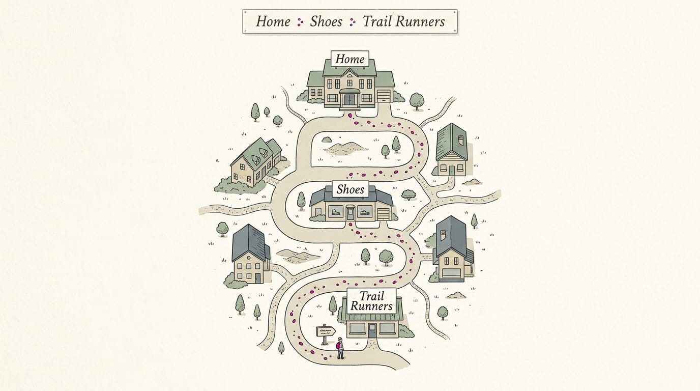
Website breadcrumbs are a short trail of links that shows where a page sits in a site’s hierarchy and lets visitors jump to broader sections. Use clear, consistent location trails on sites with several layers, keep the current page label unlinked, and make links easy to read and tap on phones; structured data can help search engines understand the trail. They improve orientation and browsing, but small, simple sites may not need them.
Ever wandered deep into a big store and glanced up to find a sign showing exactly where you’re standing? Breadcrumbs do that same job online.
Website breadcrumbs are a short trail of text links, like Home > Services > Drain Cleaning, that shows where a page sits in your site and gives visitors an easy way back up.
In this post, we’ll cover the main types, when they help and when you can skip them, how they affect search, and how to set them up, including on a website builder.
What Breadcrumbs on a Website Are
Ever notice a row of small links near the top of a page? Here’s what it does, where the name came from, and where you’ve already seen it.
What does breadcrumb mean on a site?
On a website, a breadcrumb is a navigation aid: a short trail of text links near the top of a page that shows where that page sits in the site. Each link lets visitors step back up one level to a broader section in one click.
Breadcrumbs reflect the site’s hierarchy, meaning the way pages are grouped under larger sections.
Think of a dental office’s site. A patient searching for teeth whitening lands on that service page and sees Home > Services > Teeth Whitening at the top.
One click on the Services link shows everything else the office offers, with no need to start over from the homepage.
Breadcrumbs show where a page sits, not how the visitor got there, and that’s the key difference from the browser’s back button. Simple, but it works.
Where the name breadcrumbs came from
The name comes from the story of Hansel and Gretel, who drop bread crumbs to find their way home. Website breadcrumbs work the same way, leaving a trail that shows visitors the path back up.
Breadcrumb trails you already see online
You’ve probably clicked through plenty of them without noticing. Common examples include:
- E-commerce trails: an online store might show Home > Shoes > Boots > Leather Boots, so shoppers can return to all the boots in one click.
- University and healthcare trails: school and clinic websites use the same pattern.
- Familiar sites: eBay, U.S. News, and Target all show them.
- Yoast: the Yoast site shows one too.
Three Main Kinds of Breadcrumbs
Breadcrumbs come in three main types, each answering a different question for your visitor.
Trails that show where a page sits
This is the location trail, and it’s the most widespread type. It shows the path from your homepage to the page you’re on, like Home > Cakes > Birthday Cakes. The trail is static for every user, so the same page always gets the same crumbs.
Picture a local bakery’s birthday cake page: a customer who arrives from a search can click Cakes to browse the full menu.
Trails showing the filters you picked
These filter trails are common in e-commerce. They show the filters a shopper has picked, tracking what the visitor chose rather than where the page sits.
Picture a local bike shop’s online store, where a customer narrows tires to 26-inch, then to hybrids.
The crumbs read Tires > 26-inch > Hybrid, and each one is removable or editable, so the customer can drop the hybrid crumb and keep the size in a single click. No starting over.
They’re often paired with a location trail, so shoppers see both views at once.
Trails that follow your browsing history
The history trails list the pages a visitor has moved through, in order. They’re seen as redundant to the Back button, which already lets visitors retrace their steps.
They’re also useless for direct arrivals: visitors who land on a page from a search or link without browsing your site first.
Think of a patient who taps a link in a text reminder and goes straight to your teeth-whitening page: there’s no history yet, so the trail is blank. Sometimes they’re combined with the other two types.
How Breadcrumbs Make Browsing Easier
Breadcrumbs do three jobs: they show visitors where they are, keep them exploring, and protect the choices they’ve already made. We’ll take each in turn.
Helping visitors know where they are
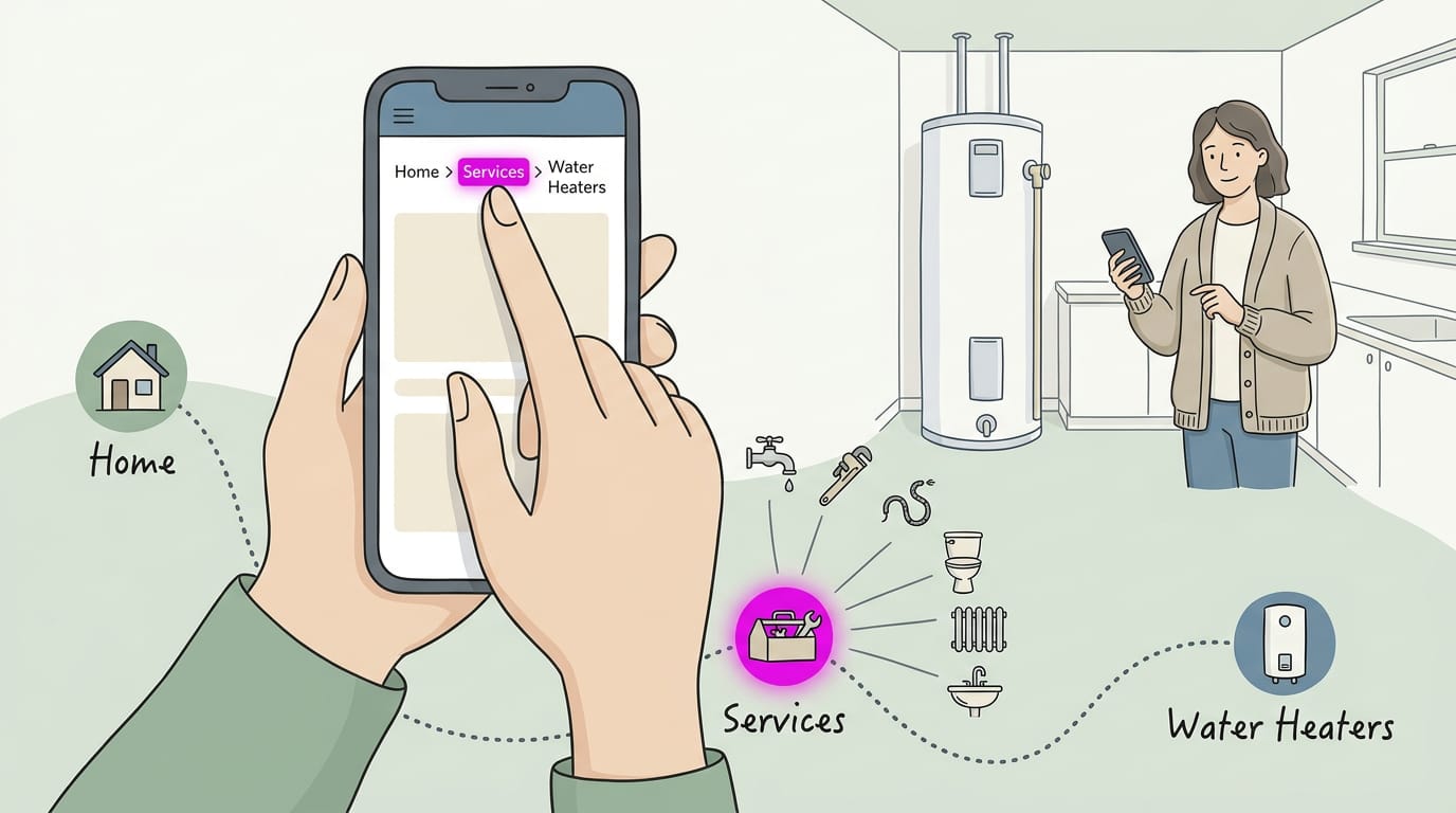
A breadcrumb trail is the row of links, like Home > Services > Water Heaters. According to research on breadcrumb usage, it tells users where they’re located and offers shortcut links that avoid the Back button.
Each crumb is also a one-tap jump to a category. Picture a homeowner who lands on a water heater page from Google: one tap up to Services shows every job the plumber offers, and they don’t have to hunt around.
Keeping visitors exploring and converting
Breadcrumbs help in four ways:
- Lower bounce rates. A bounce is a visit that ends after one page, and a clear next step gives people a reason to stay.
- More pages explored. Each crumb is an invitation to one more click.
- Better conversion rates. Conversion rate is the share of visitors who book or buy. On shopping sites, breadcrumbs let shoppers move between products and their categories, supporting the purchase journey, according to a study of retail breadcrumbs.
- Alternative to returning to Google. Hitting Back can dump a visitor into search results, where competitors are one click away. A breadcrumb lets them go up a level instead of back to Google.
Keeping filters and checkout steps intact
A shopper who filtered by size and color can click a breadcrumb back to the category with those filters still applied, if your site is set up to keep them.
Progress trails also help with forms and checkout. A patient booking a cleaning sees Choose Service > Pick a Time > Your Details and knows how many steps remain.
The Back button may remember where a visitor was but not what they chose, so filters and half-filled forms can vanish. Nobody enjoys starting over.
How Breadcrumbs Help Your SEO
Breadcrumbs guide visitors and give search engines a map too. Here’s what that means for SEO and where setups go wrong.
How search engines read your structure
Search Engine Land’s guide to SEO breadcrumbs notes that correctly implemented breadcrumbs give search engines consistent pathways that can indirectly support crawl discovery, especially on large, complex sites. Here’s how:
- Clearer structure. Google sees how categories and pages nest.
- Crawling and indexing. Crumbs give crawlers another route to your pages, which can support indexing as your site grows.
- Stronger internal linking. Each crumb links one page to another.
- Link equity distribution. Those links pass link equity, the ranking value that flows between pages, up to your category pages.
Showing breadcrumbs in search results with schema
Add BreadcrumbList structured data, a block of schema markup that labels your content for search engines, and Google can show your trail in results instead of the raw URL.
Consider a dental office whose teeth whitening page sits under a Cosmetic section. In results, the trail can read Home > Cosmetic > Teeth Whitening, so patients see where it fits.
Build trails around the routes customers take, not your server’s folder names.
Run the markup through a schema validator before publishing. Common errors:
- A trail that doesn’t match the visible page.
- Items listed out of order.
- Required fields left out.
Writing the current page crumb naturally
Keep the last crumb, the page your visitor is already on, as plain text, not a link. Linking it to itself goes nowhere.
Use the main keyword, the phrase people type into search, wherever it reads naturally. Think of a plumber whose last crumb reads Water Heater Repair. A customer scanning results sees their own words, not a folder code like wh-repair-03.
Are Breadcrumbs Necessary for a Website?
Short answer: not always. Breadcrumbs are the trail of links at the top of a page (Home > Services > Drain Cleaning). They show where a visitor is, not how they got there, so they only pay off on sites with enough layers to get lost in.
Sites that benefit most from breadcrumbs
Evaluate site structure first: if your deepest page takes several clicks to reach from the homepage, breadcrumbs will likely help. They’re most useful for:
- Multi-level site structures: pages nested several layers deep.
- E-commerce and news sites: shops and sections with subcategories.
- Educational platforms: a lesson inside a unit inside a course.
- Multi-location or multi-service sites: use them when each city or service has its own page. A visitor on a drain-cleaning page can click back to Services in one tap instead of hunting through the menu.
Sites that can safely skip them
Plenty of sites get along fine without them:
- Small flat websites: every page is one click from the homepage.
- Simple linear blogs: posts flow in date order, one after another.
- Pages with multiple categories: one trail can’t show every path, like a title on IMDb that sits in several genres.
- Five-page local sites: skip them. A family dentist’s home, services, about, team, and contact pages are already in the menu, so a trail would only repeat them. Nobody gets lost.
Spots where breadcrumbs backfire
- No breadcrumb on homepage: the homepage is the top of the trail, so a lone “Home” crumb just adds clutter.
- Single self-linking trail confuses: a last crumb that links to the current page makes the trail loop back on itself. Make it plain text.
Designing Breadcrumbs That Work Well
Good breadcrumbs are quiet. They sit where people expect them, read at a glance, and look the same on every page. Here’s how we’d place and style them.
Where the trail should sit
Most visitors look for the breadcrumb trail just below the main navigation and above the main content, so that’s where it belongs. Some sites repeat it at the bottom of long pages, which helps anyone who scrolled to the end and wants to step back up.
Take a dental clinic with a teeth whitening page. A patient who finds it from a search sees Home › Services › Teeth Whitening above the content and can tap back to the services list in one move.
Put it where people look for it, not where it’s easiest for you to build.
Keeping the trail clean and readable
Use the same format and separators (the symbols between levels) across your whole site. Chevrons (›) and arrows (→) are common choices because they signal direction, and that’s exactly what a trail is for. Pick one style and stick with it.
Keep the design small and simple: a quiet line of text, not a row of colorful buttons. Use a clear font that’s easy to read on a phone, with enough contrast against the background to stay readable in bright light. Plain beats fancy here.
Choosing which labels to show
Shorter trails are easier to scan, so show only the essential levels:
- Essential levels only: Home › Services › Drain Cleaning scans faster than a six-step trail that mirrors every folder on your site.
- Descriptive labels: Drain Cleaning tells visitors what the page does. Page 3 tells them nothing.
- Match page titles: The last label should match the headline, so people know they’ve landed where they expected.
- Avoid redundant categories: If a plumber’s trail reads Plumbing › Plumbing Services › Drain Cleaning, the middle levels repeat each other, so cut one.
Keep it consistent and test it
Give every page the same look: same position, same separator, same font size. When the trail changes style from page to page, visitors stop trusting it and go straight back to the menu.
Then test with real people. Ask a few customers, ideally ones who’ve never seen your site, to find a service and get back to the services list. Watch where they hesitate, and fix whatever tripped them up.
Check the trail on a phone, tablet, and desktop too, since long labels can wrap or get cut off on small screens.
Testing beats guessing.
Ways to Add Breadcrumbs to a Site
We’ll look at two routes, plus one planning step that makes either one work. If you use a website builder, check its settings first, since some include a breadcrumb trail you can switch on.
Adding breadcrumbs in WordPress with Yoast SEO
If your site runs on WordPress, the Yoast SEO plugin, built for search engine optimization (SEO), is a quick route. Here’s what to look at:
- Yoast breadcrumbs settings. Turn the trail on without any coding.
- Add code to theme. If your theme doesn’t show the trail, add a short snippet of code to its files.
- Yoast breadcrumb block. Place the trail wherever you want it on a page.
- Other plugins. Other options can add breadcrumbs too, so compare them.
Coding breadcrumbs by hand
Want full control? Code the trail yourself in HyperText Markup Language (HTML), the code that structures pages, and style it with Cascading Style Sheets (CSS). JavaScript, which adds interactivity, is optional for a simple trail.
This route needs developer skills, so hand it off if code isn’t your thing. Test it across browsers and phones, since layouts shift. Don’t skip it.
Map your site structure first
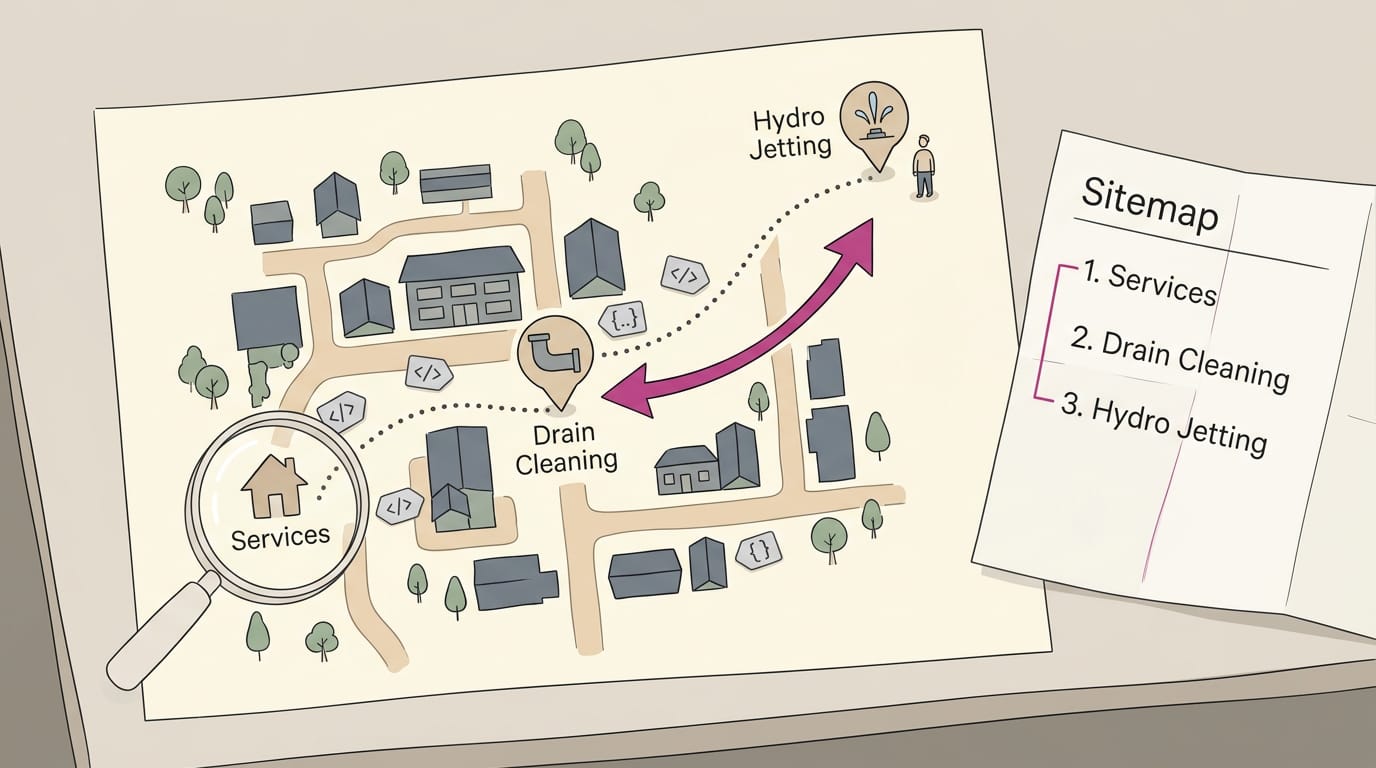
Do this before either route above. Each breadcrumb links to an ancestor page, the parent above the current page. Picture a plumber whose site runs Services, then Drain Cleaning, then Hydro Jetting.
A customer who lands on hydro jetting from a search can tap back to Drain Cleaning and keep browsing. Build the trail around how customers think, not how your files are stored.
Next, add microdata or schema markup so search engines can read what each link means, then check the trail in Google Search Console. Finally, plan your sitemap, the list of pages search engines use to find your site, so the trail and the list match.
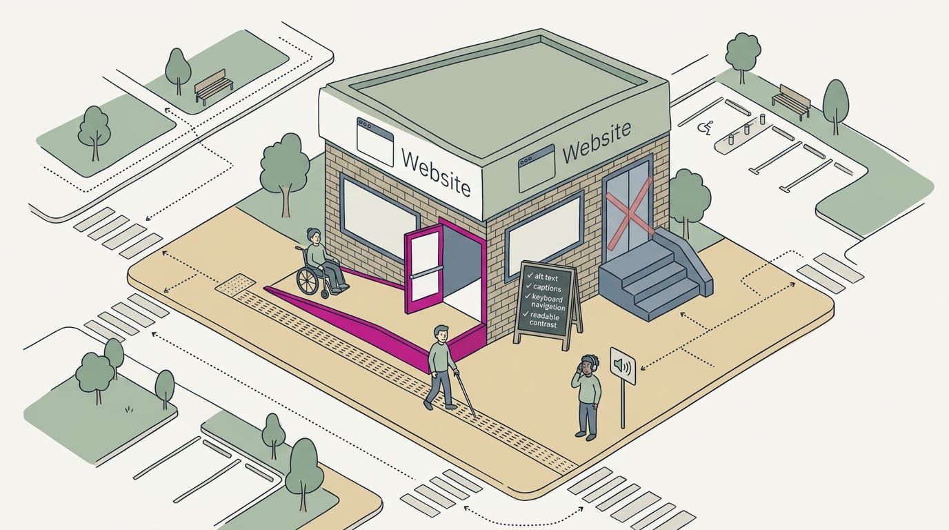
Making Breadcrumbs Usable for Everyone
Every visitor needs to see, tap, and understand your crumbs. Here’s how to build them so they work for everyone.
Designing crumbs everyone can use
Start with the details that make crumbs easy to spot and tap:
- Adequate color contrast. Make the text stand out from the background so it’s readable for people with low vision or a dim screen.
- Large touch targets. Give each crumb enough room for a thumb to hit it on the first try.
- ARIA labels. ARIA (Accessible Rich Internet Applications) tags tell screen readers what each part of the page does, so give the trail a clear name.
- Alternatives to swiping. A sideways-scrolling strip can hide the start of the trail from anyone who can’t swipe. Let the trail wrap onto a second line instead.
Who benefits and when it’s required
Clear crumbs give people with disabilities a clear path through your site, including screen reader users and visitors with limited hand movement.
Google’s Search Central documentation notes that a breadcrumb trail shows a page’s position in the site hierarchy and may help users understand and explore a site effectively. Good crumbs help people see where they are, not just how to get back.
Picture a patient booking a cleaning on a dental office’s site while balancing a coffee. A big ‘Services’ crumb lets them jump back in one tap instead of hunting for the menu.
Website accessibility is a legal requirement in some places, so check the rules where you do business. Build crumbs for the hardest phone to use, and they’ll work for everyone.
Making Breadcrumbs Work on Phones
Phones have less room than desktops, so the trail has to shrink without losing its job. Here’s how to make that happen.
How phones and desktops differ
On a desktop, breadcrumbs sit in one tidy row. On a phone, that same row can eat a big slice of the screen before anyone reads a word. The aim is useful links, not every link. Here’s what changes:
- Limited screen space: every character counts on a narrow screen.
- Condensed mobile trails: the path gets trimmed to the levels that matter most.
- Full trail on desktop: a wide screen has room for every level.
- Responsive design: the layout adjusts to each screen, so one site serves every device.
Ways to save space on small screens
A few simple changes keep the trail readable:
- Single-line trail: keep the path on one line so it never stacks into rows.
- Show only the parent level: display just the step above, such as Services above a page called Emergency Drain Cleaning.
- Truncate long labels: shorten a long page name with an ellipsis (…) so it fits.
- Horizontal scroll with cues: if the full trail must stay, let it scroll sideways with a visible arrow or fade at the edge.
Common mobile mistakes to avoid
Picture a plumber’s customer on a cold morning, thumb-scrolling for the emergency line past a row of tiny links.
Each link is too small to tap, so the customer hits the wrong one, backs out, and calls the next plumber. That’s one tiny link and one lost call.
- Overcomplicated trails: a long chain of levels turns the top of the screen into clutter.
- Small touch targets: each link needs room for a fingertip, not a pinpoint.
- No scroll indication: a trail that quietly cuts off looks like it ends early.
- Inconsistent style: a trail that changes from page to page makes visitors wary.
Breadcrumbs answer a simple question every visitor has: where am I, and how do I get back? When your site has layers, they keep people oriented. On a small site, you may not need them at all, so let your site’s size and structure decide.
If you do add them, start with your builder’s built-in option and check how they look on a phone. Clear navigation helps people find what they came for, and that’s often a call or a booking. Give people a way back, and they’ll explore further with you.
References
- (PDF) Breadcrumb Navigation: Further Investigation of Usage — researchgate.net (2003)
- Breadcrumb Navigation Deployment in Retail Web Sites — doi.org (2019)
- SEO breadcrumbs: Structure, benefits & best practices — searchengineland.com (2025)
- How To Add Breadcrumb (BreadcrumbList) Markup | Google Search Central | Documentation — developers.google.com
Questions
Are breadcrumbs necessary for a website?
No. Breadcrumbs are most useful on websites with several layers, such as online stores, news sites, and educational platforms. Small, flat websites with only a few pages can usually skip them.
What does "breadcrumb" mean?
A website breadcrumb is a short trail of links, usually near the top of a page, that shows where the page sits in the site's hierarchy. For example, Home > Services > Drain Cleaning lets visitors jump back to a broader section.
Sources
- (PDF) Breadcrumb Navigation: Further Investigation of Usage, researchgate.net,
- Breadcrumb Navigation Deployment in Retail Web Sites, doi.org,
- SEO breadcrumbs: Structure, benefits & best practices, searchengineland.com,
- How To Add Breadcrumb (BreadcrumbList) Markup | Google Search Central | Documentation | Google for Developers, developers.google.com