What Is CTA in Marketing? Meaning, Examples, and Tips
What is a CTA in marketing? See how prompts to call, book, or get directions guide visitors, with practical tips to write, place, and test CTAs.

A call to action (CTA) in marketing is a short prompt that tells someone the specific next step to take, such as booking, buying, calling, or signing up. Effective CTAs use clear, relevant action words, focus on one goal, stand out where people are ready to act, and lead to the promised destination. Make the next step easy and trustworthy, then test clicks and completed actions to improve results.
Think of the ‘Open, come on in’ sign on a shop door. It’s short, it’s clear, and it tells people exactly what to do next. A website or online listing works the same way.
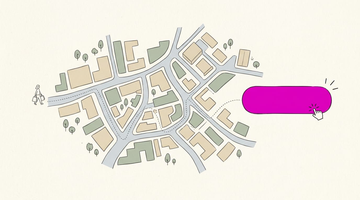
A call to action (CTA) is the short prompt that asks a visitor to take one specific step, such as calling you, booking a visit, or getting directions.
In this post, we’ll look at what CTAs are, how to write copy that gets clicked, where to place them, and how to test them. Let’s get more people picking up the phone.
What a CTA Is in Marketing
A call-to-action (CTA) is the line on your page that tells visitors what to do next. Here’s what it means and where you’ll find one.
What CTA stands for and what it asks
CTA stands for call-to-action, and the name says what it does: it prompts a specific action. A good one uses imperative wording, the direct “do this” verb form, like “Call today” or “Get directions,” and it provokes an immediate response.
Vague wording like “Learn more” invites a browse, while “Book your cleaning” asks for a yes. Picture a dental office with a lovely homepage photo and a phone number in tiny print.
Swap in one clear button, and visitors know their next step. Make it obvious.
Common formats CTAs take on a page
CTAs show up in a few familiar forms:
- Buttons: the solid, colored shapes visitors look for first.
- Hyperlinks and text links: a phrase in your copy, like “book an appointment.”
- Banners and graphics: a strip across the top or an image that carries the offer.
- Forms: a short set of fields, like name and preferred day, for visitors to fill in.
- Pop-ups: a box over the page that asks for one click before visitors move on.
Actions people are usually asked to take
Every CTA asks for one thing. The most common asks are:
- Buy or add to cart: the classic ask for online stores.
- Subscribe or sign up: an invitation to join a list or create an account.
- Download a resource: a menu, price sheet, or guide people can save.
- Start free trial: a way to test a service before committing.
- Contact or request quote: the ask most local service businesses use.
Think of a plumber whose site offers a free estimate form. Filling it in is one clear step toward a booked job.
Why CTAs Matter for Results
Every call to action (CTA) is a request, and it either gets a yes or gets ignored. Here’s how CTAs help turn visitors into callers and buyers.
How CTAs lift conversions along the funnel
A conversion is any action you want, like a call, a booking, or a purchase. A clear CTA lifts your conversion rate, the share of visitors who act, because it shows them the next step.
Each CTA nudges visitors further down the funnel, the path from first visit to paid job. Fewer steps mean fewer people drop off along the way, which streamlines the buyer’s journey.
CTAs also support conversion rate optimization (CRO), the ongoing testing of pages to get more action. They’re an easy starting point because they’re simple to change and compare.
Turning visitors into leads and sales
A lead is someone who shares a way to follow up, like an email address. A CTA such as “Get our seasonal checklist” collects that from people who aren’t ready to buy yet.
Ready buyers need a push too. A dental clinic’s “Book a cleaning” button, placed right under its appointment details, catches the patient who’s already decided.
Tie every CTA to a goal like more calls or bookings. If it doesn’t serve one, it’s just decoration.
Keeping people engaged and reducing friction
Visitors are either passive, reading and leaving, or active, clicking, tapping, or calling. A CTA is what makes that switch.
Friction is anything that makes someone pause and wonder what to do next. A clear next step, like “Call for a same-day quote,” removes it.
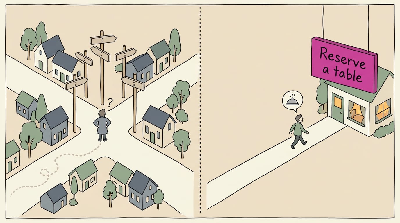
A bounce happens when someone leaves without clicking anything else. A restaurant homepage with six competing buttons can cause decision fatigue, when a visitor gives up choosing.
Swap in one main CTA, “Reserve a table,” and a hungry customer can decide in seconds.
Measuring CTA results and ROI
According to the research behind AdAlyze Redux, a tool for tuning online ad copy, CTA optimization can be measured by tracking click-through rate (CTR) and conversions. Focus on four things:
- Clicks and conversions. A button with many clicks but few calls points to a problem after the click.
- Behavior. Your numbers show what visitors actually do, not what you hope they’ll do.
- Landing page lift. A landing page is the page visitors reach from an ad or search. Test a new version against the old one, and the difference in conversions is your lift.
- High ROI. Return on investment (ROI) measures payoff. Button text costs little to test, so it’s often a high-return change.
Getting your brand message seen
Every CTA is also a branding moment. Its color and wording are often the first things a visitor’s eye lands on.
Keep the words in your own voice, like a barbershop’s “Book your chair,” so the button sounds like the shop instead of a template. Repeat the same look on every page so your brand sticks. Small, but it’s seen on every visit.
Writing CTA Copy That Gets Clicked
Your call to action (CTA) is only as strong as its wording, so small word choices matter.
Keep CTA wording clear and short
Clear, unambiguous wording beats clever every time. Your CTA should tell people exactly what happens when they tap it.
“Book a cleaning” works, while “Unlock your best smile journey” leaves people wondering what they’ve signed up for. Aim for clear rather than clever.
Picture a dental office whose button says “Submit.” Patients can’t tell whether they’re booking a visit or sending a question. “Book your cleaning” removes the guesswork. Fewer words, fewer questions.
Keep it to two to four words where you can.
Lead with a strong action verb
Start with a verb that tells people what to do. Imperative wording, a direct command like “Call” or “Book,” reads as a clear next step. Specific action words win: “Get directions” beats “Learn more.” Three verbs cover most local businesses:
- Call us today
- Book your appointment
- Get directions to our shop
Consider a plumber whose site says “Contact us.” Swapping in “Call now for a repair quote” gives a worried homeowner one clear step. The more specific the verb, the less your reader has to guess.
Put the benefit front and center
Readers click when they can see what’s in it for them. Low-risk, high-value CTAs ask for a small commitment and promise something useful, so they feel safe to tap. Lead with the value, not the action.
Imagine a tire shop choosing between “Schedule service” and “Keep your car safe on wet roads. Book today.” The second tells a driver why to act now.
Using time-sensitive phrases and offers
Phrases like “this week” or “while appointments last” give people a reason to act now. Limited-time offers need real deadlines. Much of the pull comes from fear of missing out (FOMO), the urge to act before it’s gone.
Countdown timers add a visual push, so use them only for real deadlines and never reset them.
Consider a restaurant whose patio closes for the season. A button reading “Reserve a patio table before the season ends” turns a vague someday into a booking this week.
Earning trust with honest, believable copy
Build trust by making only promises you can keep. If the button says “Book,” the next page should let people book. If it says “Get directions,” it should open a map, not a sales form.
Think of a bakery whose “Get directions” button opens a menu page. Visitors end up hunting for the address, which is exactly the friction a CTA should remove.
A real customer quote or a guarantee you actually honor gives hesitant readers a reason to believe you. Genuine urgency only: a deadline you can’t back up costs you that trust. Trust builds slowly and breaks fast.
Tailoring CTA wording to each audience
Think about who’s tapping: a parent booking a haircut and a contractor reordering supplies need different words.
Personalized messaging speaks to someone’s situation. “Need a repair this week?” reaches a person with a problem, while “Our services” reaches nobody in particular.
Try first-person wording like “Book my cleaning” against “Book your cleaning” and see which one your customers pick. Only testing shows what works for your audience.
Business-to-business (B2B) buyers usually need more detail before they commit, so “Request a proposal” fits better than “Buy now.” Business-to-consumer (B2C) customers often want a quick, low-risk step like “Book” or “Call.”
How to Design and Place CTAs Well
A call to action (CTA) is the button or link that tells visitors what to do next. It only works if people see it and tap it.
Using color so CTAs stand out
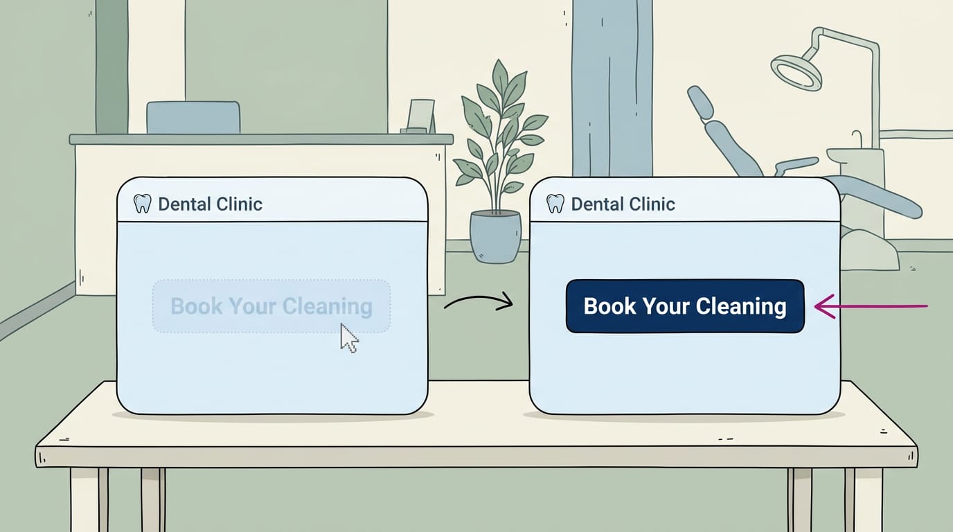
Choose a color that contrasts with the background instead of blending in. Start from your brand palette, but pick the shade that stands out most. Keep the label readable too, which helps people with low vision or color blindness.
Picture a dental office with a soft blue website. Its “Book Your Cleaning” button in the same pale blue vanishes. Switching to the navy from its logo makes it the first thing visitors see.
Button size, shape, and breathing room
Make the button obvious, not oversized, so it catches the eye without looking like a banner ad. A rounded rectangle with a clear label reads as a button at a glance. Give it whitespace, the empty space that keeps nearby content from crowding it.
Consider an auto shop whose “Schedule Your Oil Change” button is squeezed between a coupon and a service list. Add some room, and it’s the first thing a busy parent sees.
Placing CTAs where people will see them
Put your CTA where attention already is and where people are ready to act:
- Above the fold. Your main CTA belongs in the part of the page visible before scrolling.
- After engaging content. Put it right beneath the paragraph that won someone over.
- At decision points. Place a CTA beside prices or service menus, where people weigh their options.
- Easy to find. Use the same spot on every page so nobody has to hunt.
A restaurant puts a “Call to Reserve” button beside its menu and at the bottom. Diners can book the moment they decide.
Making CTAs easy to tap on phones
Many customers search on a phone, often from a parking lot, so design for a thumb first:
- Easily tappable. Make the button tall and wide enough to hit without aiming.
- Thumb-accessible position. Keep buttons in the lower part of the screen, where a thumb reaches easily.
- Fast loading. A slow page can lose people before they ever reach the button.
- Tap-to-call button. It opens the phone’s dialer with your number filled in, so one tap calls you.
Picture a plumber whose customer types “emergency plumber” at 9pm with a leak. A tap-to-call button connects them to a person right away, instead of making them copy a number.
Keeping CTAs relevant to the content
A CTA should match the words right above it. A bakery that’s just described its wedding cakes should end with “Request a Wedding Quote,” not a generic “Contact Us.”
Keep your wording consistent, too. If your ad says “Book Today” but the button says “Submit,” visitors wonder if they’re in the right place.
Align each button with what the reader needs. Someone ready to visit wants “Get Directions,” a routine appointment calls for “Book Online,” and an urgent problem needs “Call Now.” Match the button to the moment.
Types, Channels, and Examples of CTAs
Every call to action (CTA) tells the reader what to do next, so match the wording to your goal and to where people see it.
Choosing a CTA based on your goal
- Direct purchase: ‘Buy Now’ or ‘Add to Cart,’ for customers ready to pay.
- Free trial and lead-gen (collecting contact details): ‘Start Your Free Trial’ or ‘Get a Free Estimate.’
- Curiosity/learn-more: ‘See How It Works,’ for readers who want more detail first.
- Sign-up: ‘Join Our List,’ for updates or membership.
- Email-capture: ‘Get Our Weekly Tips,’ in exchange for an email address.
Think of a plumber whose goal is a phone call. A customer with a leaking pipe at 9pm wants to talk to someone, not read another page, so ‘Call Now’ beats ‘Learn More.’ Pick one goal per page, not three.
What CTA stands for in email marketing?
In email marketing, CTA still means call to action: the button or link asking the reader to act. The same idea shows up in these channels:
- Web conversion pages: where visitors book or buy
- Email campaigns: one main button drives the message
- Social media: post text and profile links
- Display and search ads: a short prompt beside the headline
- Landing pages: a single page built around one offer
A CTA ad is an ad built around one clear prompt, like ‘Get Directions,’ so viewers know their next step. In email, the CTA is usually the button that leads to your offer, like ‘Reserve Your Spot.’
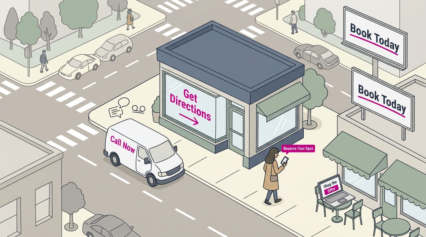
Offline and phone CTAs work too. A van can say ‘Call Now,’ a window decal can say ‘Get Directions,’ and a voicemail greeting can name the next step.
Sample CTA phrases you can borrow
Here’s a starting list. Match each phrase to your offer:
- Get Started for Free: trials and low-cost first steps
- Shop Now: products ready to buy
- Download Free Ebook: a guide traded for an email address
- Request a Quote: jobs priced one at a time
- Reserve Your Spot: classes, tours, or limited seats
- Call Now: urgent needs, like same-day repairs
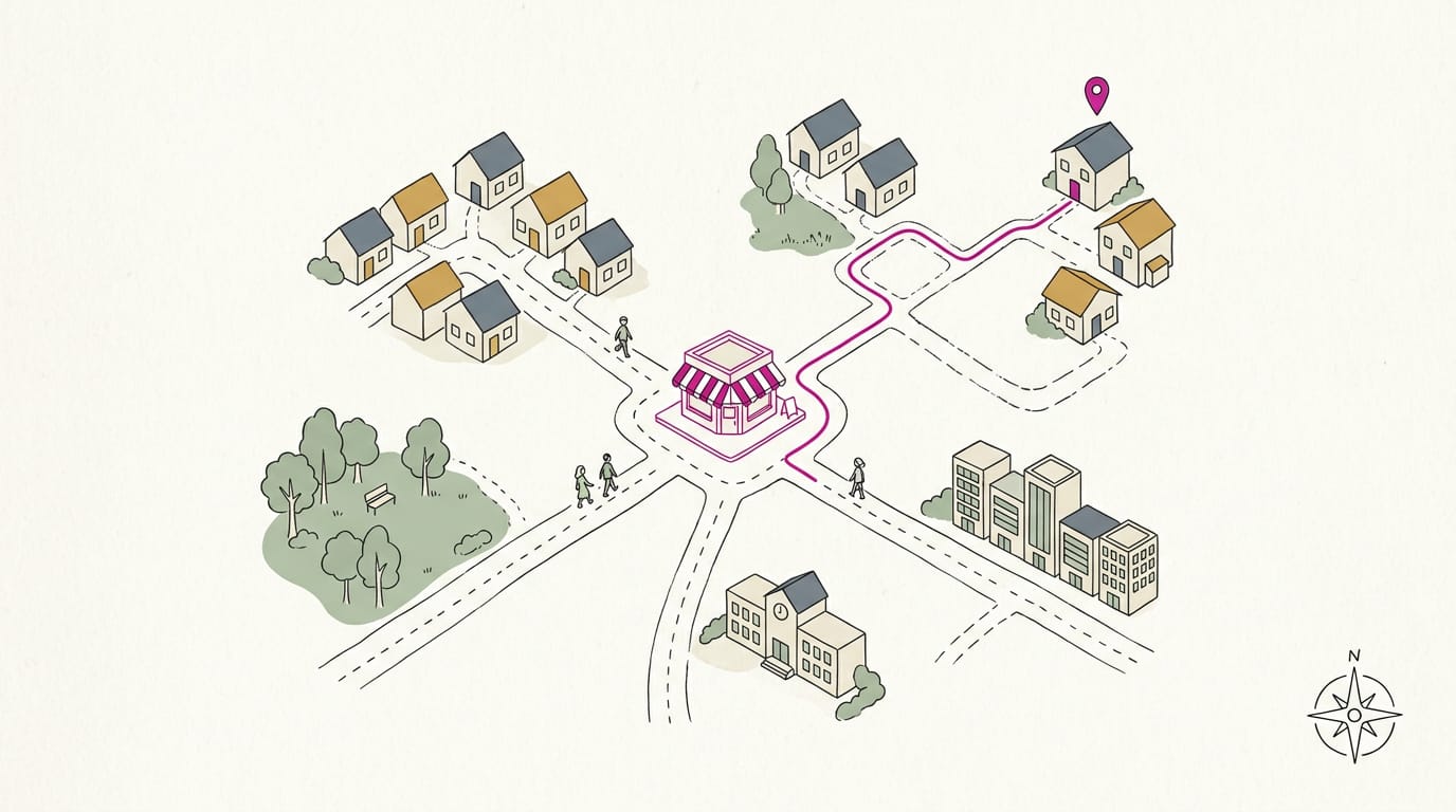
- Get Directions: shops and restaurants people visit
- Book Online: appointments for salons and clinics
Specific verbs beat vague ones, so ‘Book Online’ is clearer than ‘Click Here.’
How real brands use CTAs
Amazon’s ‘Add to Cart’ button gives a product page one clear next step. Tidal’s free trial starts with a low-risk first step before any payment.
Perion and Owl Labs are worth a look: visit their sites and notice which single action gets the most visual weight. Then borrow the habit, not just the wording.
How to Test and Improve Your CTAs
A call to action (CTA) only works if people act on it, so test to see which version wins.
Comparing CTA versions with A/B tests
An A/B test compares CTA variations, such as different text, colors, or placement, as a thesis on conversion rate optimization explains, and keeps the one that converts more users into customers.
Run both versions at the same time so a busy weekend doesn’t favor one. Give it several weeks before you decide.
Think of a dental office that tests “Book now” against “Book your cleaning.” The winner brings in more online bookings, and the front desk gets a fuller calendar.
Steps for running a CTA test
Follow these steps:
- Define your goal. Pick one result to track, such as calls, bookings, or direction requests.
- Create A and B versions. Change one element so you know what caused the difference.
- Limit traffic exposure. Show the new version to part of your visitors first, so a weaker one doesn’t cost many calls.
- Review results and iterate. Keep the stronger version. Then test again.
Metrics that show whether CTAs work
Set up click tracking on every button first, so each click counts toward the right version.
Two numbers matter most:
- Click-through rate (CTR): clicks divided by impressions, or how many times your CTA was shown.
- Conversion rate: the share of visitors who finish the goal, such as booking or calling.
A paper on assessing the relative performance of online advertising media notes that both help marketers judge CTAs and compare results across industries.
A useful CTR benchmark to aim for is 2 to 5%. Compare against others in your industry, and look for more bookings, not just more clicks.
Mistakes That Weaken CTAs
A call to action (CTA) tells visitors what to do next. When yours is unclear, crowded, or pushy, it quietly costs you calls.
Wording mistakes that confuse readers
Four wording slips do most of the damage:
- Vague phrases. “Learn more” doesn’t say what happens next. “Book your cleaning” does.
- Misleading destination. A “Book Now” button that lands on your homepage makes people feel tricked.
- Unclear next step. “Submit” leaves people wondering if a call or an email comes next. Try “Request a callback.”
- Too long text. “Call us today for a free quote on any service” is a sentence, not a button. Keep it short.
Take a dental office whose button reads “Learn More.” Visitors click, read about services, and leave without booking. Change it to “Book a Cleaning” and the same visitors know exactly what to do.
Layout problems that dilute your CTAs
- Too many CTAs. Asking for a call, a booking, and a newsletter signup at once means visitors pick none of them. Choose one main action per page.
- Poor placement. A button buried at the bottom of a long page, or below the fold (the part visitors must scroll to see), is easy to miss. Put your main CTA near the top and repeat it after key details.
- Weak visual hierarchy. If your button looks like everything else on the page, it gets lost. Make it the boldest element, not just one more link.
Fake pressure that erodes trust
Fake pressure hurts trust. Urgency works only when it’s true. A salon that posts “Only 2 spots left!” every Monday trains regulars to ignore it, so when a real rush hits, nobody believes the sign. Real urgency gets booked. Fake urgency gets ignored.
A strong CTA doesn’t have to be clever. It has to name one clear next step, sit where your customer is already ready to act, and use words they’d actually say out loud. Write it, test it, and keep what works.
When it’s done well, more people call, book, and find their way to your door. Your shop sign already showed you how this works. Make the next step obvious, and people will take it.
References
- AdAlyze Redux — doi.org (2015)
- Assessing the relative performance of online advertising media — hdl.handle.net (2014)
- Conversion Rate Optimization : Visual Neuro Programming Principles — theseus.fi (2016)
Questions
What is CTAs?
CTAs are calls to action: short prompts that tell someone what specific step to take next, such as calling, booking, or buying. They can appear as buttons, links, banners, or forms.
What is an CTA example?
A CTA example is “Book your cleaning.” It clearly tells a visitor what to do next.
What does CTA stand for in business?
In business, CTA stands for call to action. It is a prompt that asks a customer or prospect to take a specific step, such as requesting a quote or booking an appointment.
What does "CTA ads" mean?
CTA ads are advertisements built around a clear prompt that tells viewers what to do next, such as “Get Directions” or “Shop Now.”
What does CTA stand for in email marketing?
In email marketing, CTA stands for call to action. It is typically a button or link that asks readers to take a step, such as “Reserve Your Spot” or “Shop Now.”
Sources
- AdAlyze Redux, doi.org,
- Assessing the relative performance of online advertising media, hdl.handle.net,
- Conversion Rate Optimization : Visual Neuro Programming Principles, theseus.fi,